Coca Cola Company
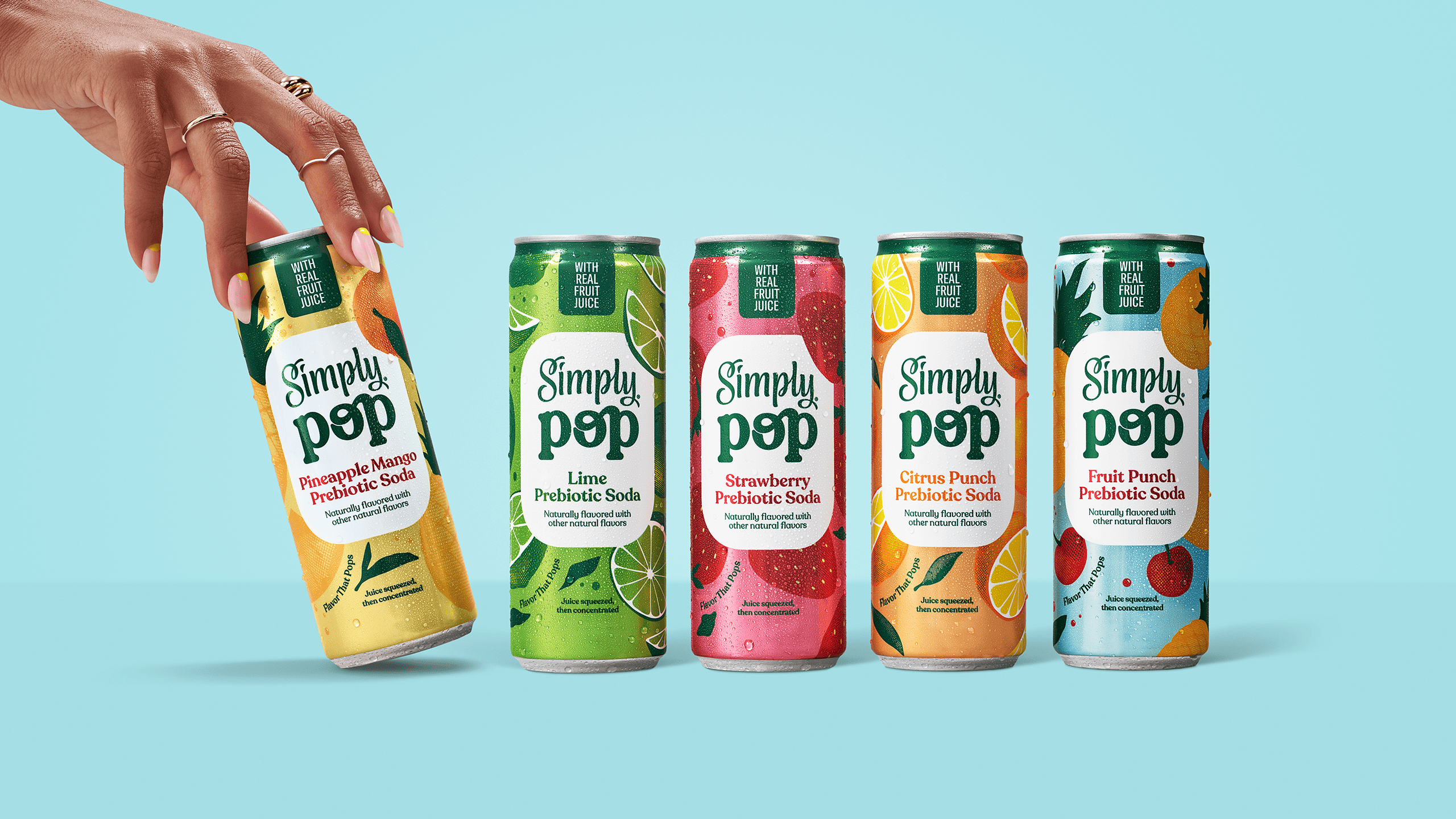
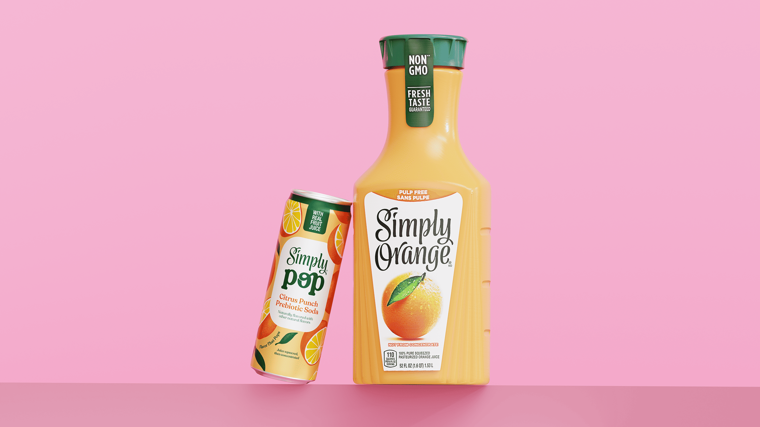
Simply Pop
Simply Pop marks Coca-Cola North America's entry into the emerging category of prebiotic sodas. Developed under the well-known Simply juice brand, the project responds to the behavior of a new generation of consumers — seeking flavor, lightness, and more conscious choices, without giving up on style.
We were invited to create the visual identity and packaging for this new product, connecting the natural essence of Simply with the expressive, graphic energy of pop culture. The challenge was to propose a new visual aesthetic for the healthy — one that feels young, vibrant, and culturally current.
.jpg)
FROM: TRADITIONAL COMMUNICATION
Solution
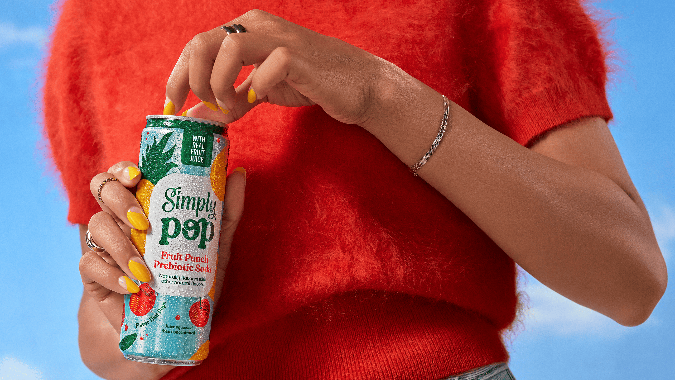
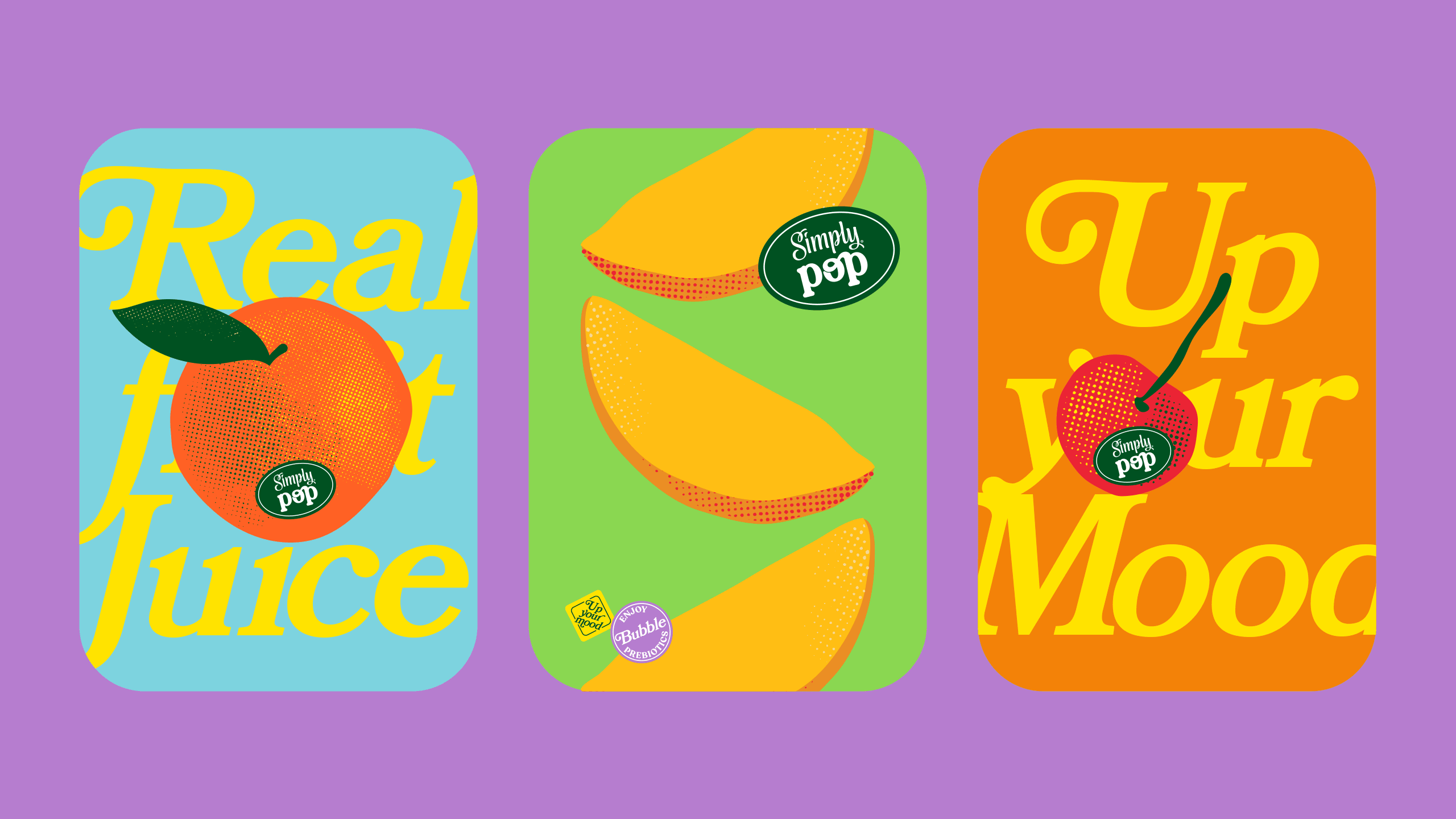
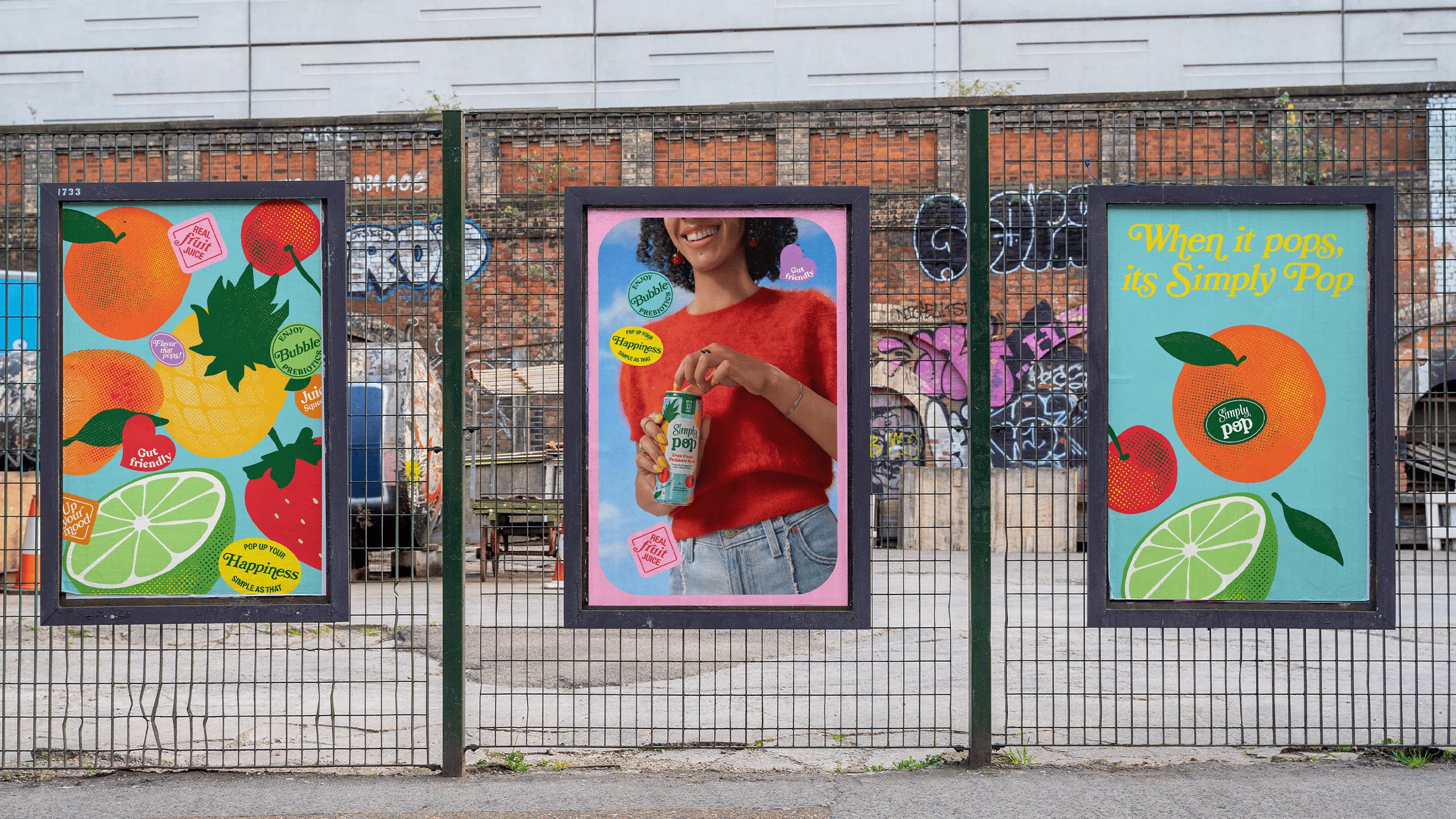
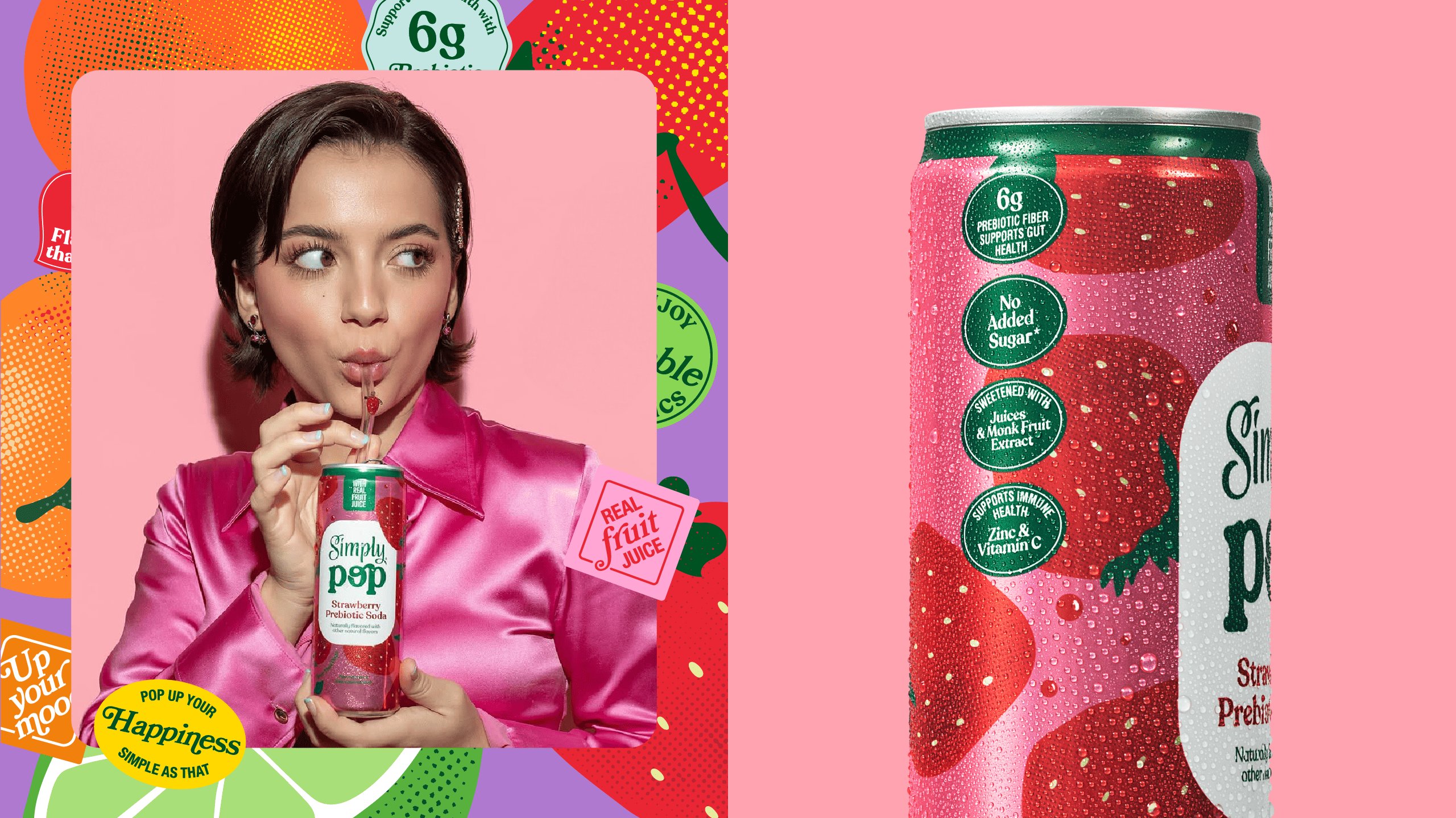
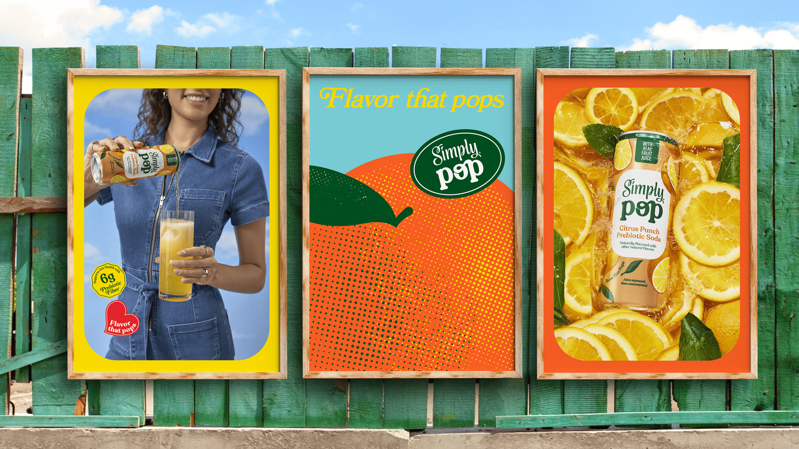
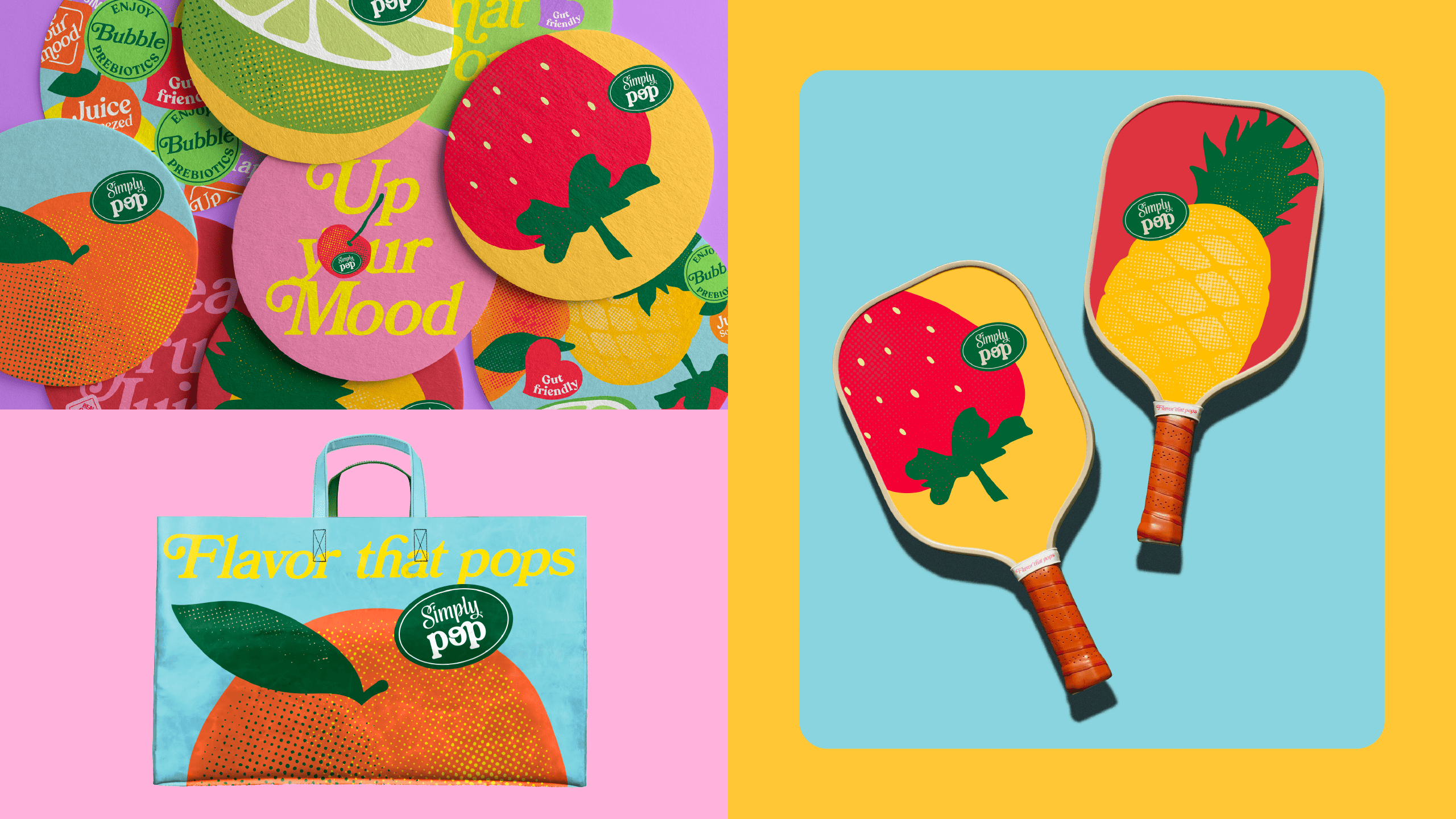
To translate the lightness and energy of Simply Pop, we created a visual language that starts from fruit — but breaks away from conventional naturalness. The system embraces vibrant colors, unexpected graphic compositions, and a sensorial, youthful aesthetic — closer to pop culture than to the typical wellness universe.
Inspired by Pop Art, the illustration style helped us reinterpret the fruit stickers — transforming them from generic labels into carriers of product personality, impact, and originality.
The language combines the simplicity of fruit with expressive, eye-catching and contemporary visual elements. The result is a brand that stands out on the shelf, connects with evolving consumption habits, and expands Simply’s reach into new experiences and territories.
Boldness is about taking risks and overturning the order. That’s what Carnival is about.
At Carnival all things are on the move, and so is the brand.
This brand has both choreography and ginga.
10 million people impacted during carnival in Rio.
7.840 people interviewed during the process.
1 billion dollars in economic movement.


To ensure that the Rio Carnaval brand was as alive and organic as Rio de Janeiro itself, we developed—in partnership with André Burnier and Plau—a creative coding tool that allows interaction with the brand through the movement of its ribbons, their thickness, motion, rhythm, and colors, all in a fully customizable way. A pulsating brand with personality and behavior, representing the creative force of all Samba Schools.

MEDIA POINTS
Distributed across
4 regions of Rio and 3 cities
in Baixada Fluminense.
CAMPAING INSERTIONS
4,433,436 ad insertions broadcasted
WEEKLY IMPACTS
60 million people reached across different channels.

.png)