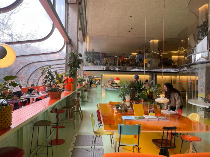
AB Inbev
Sistema Global de Identidade Visual Hoegaarden
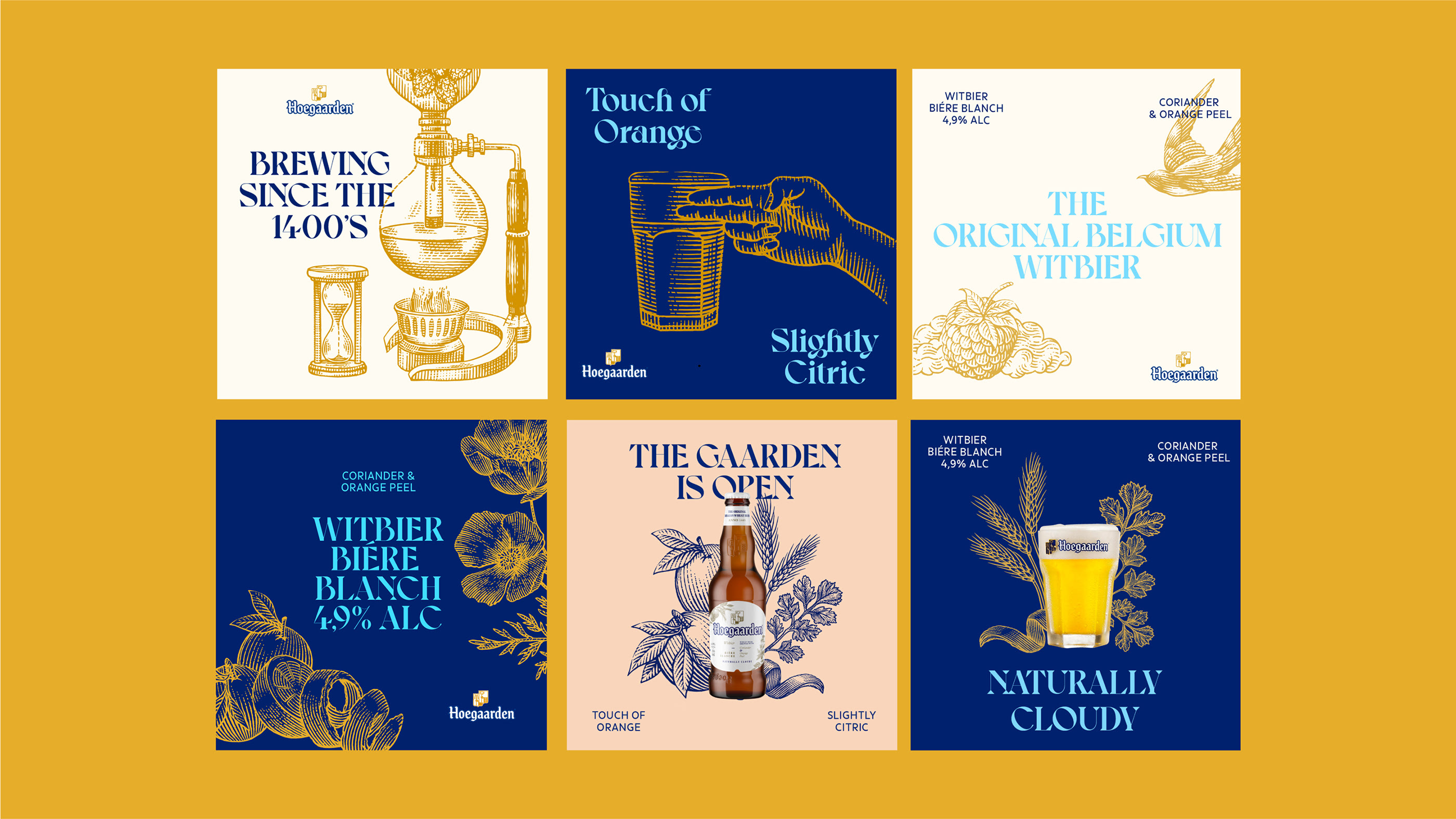
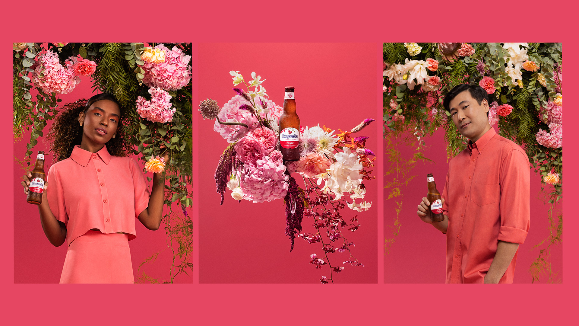
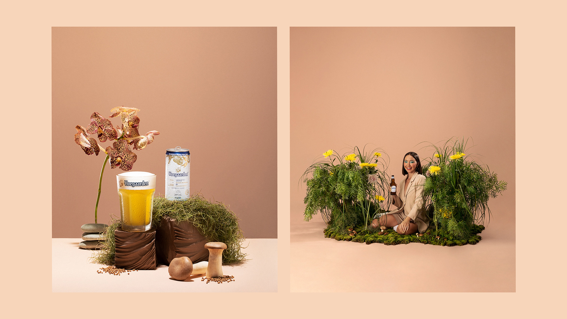
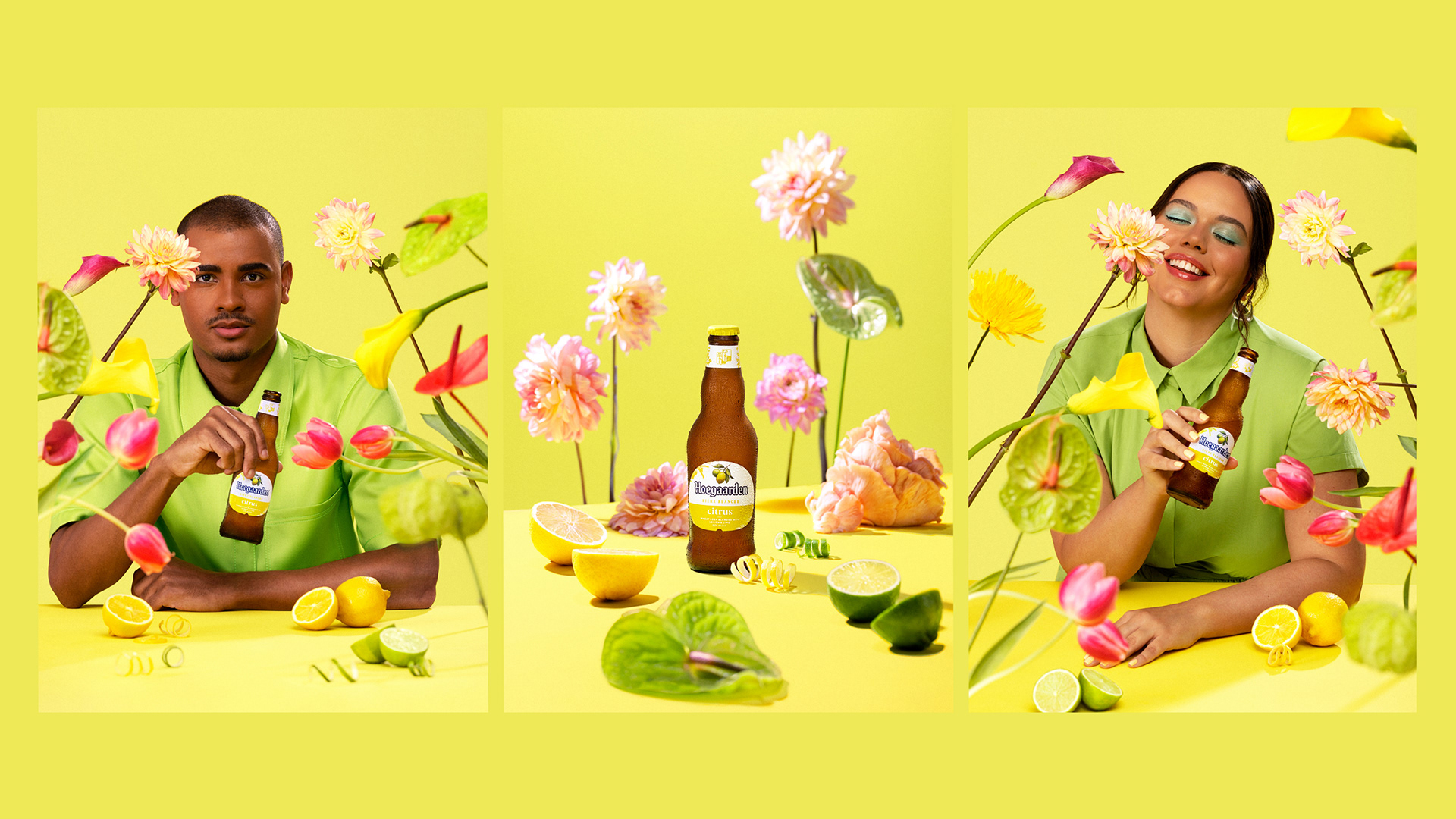
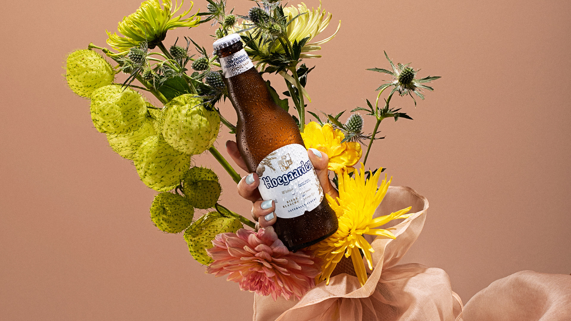
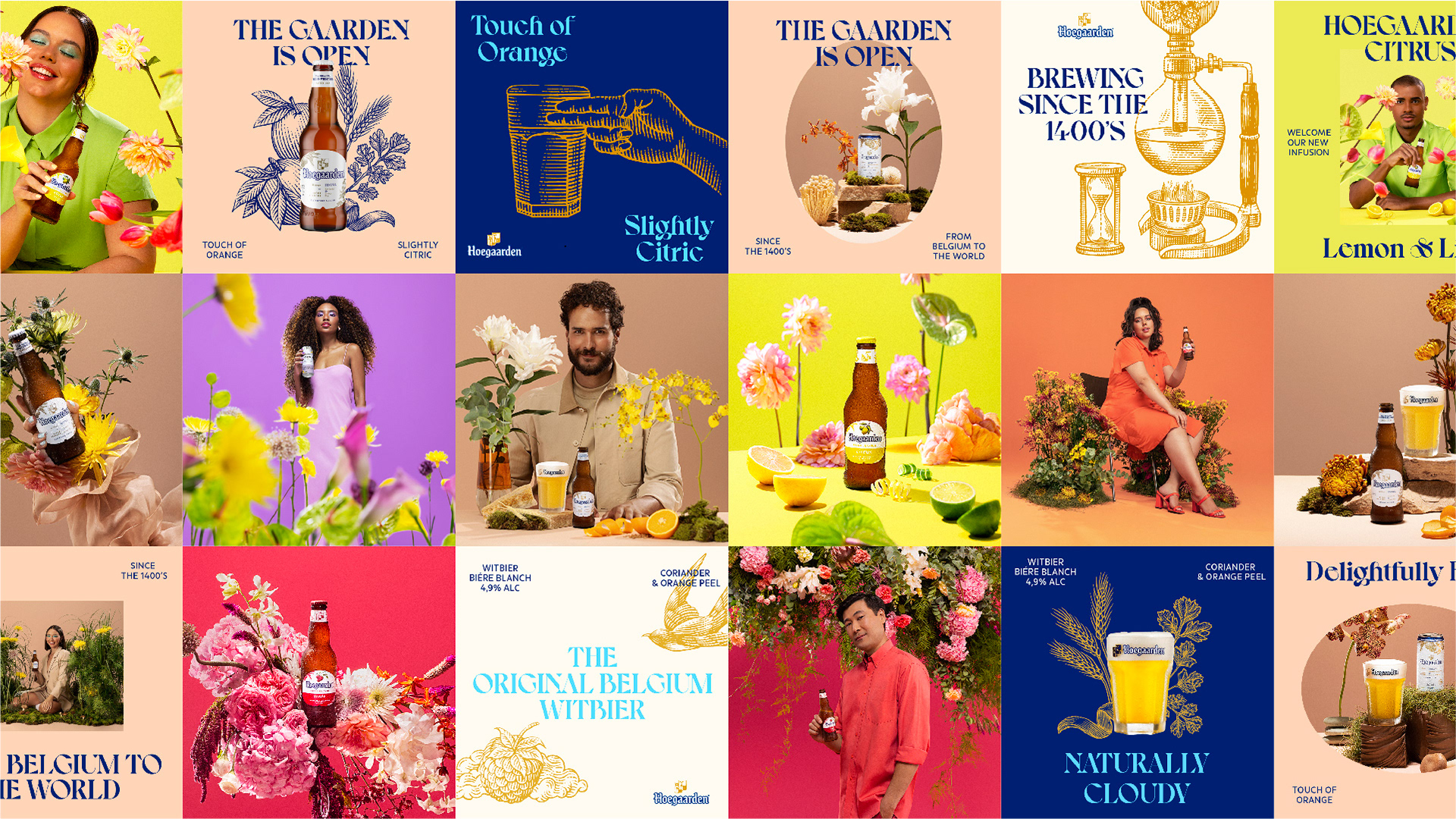
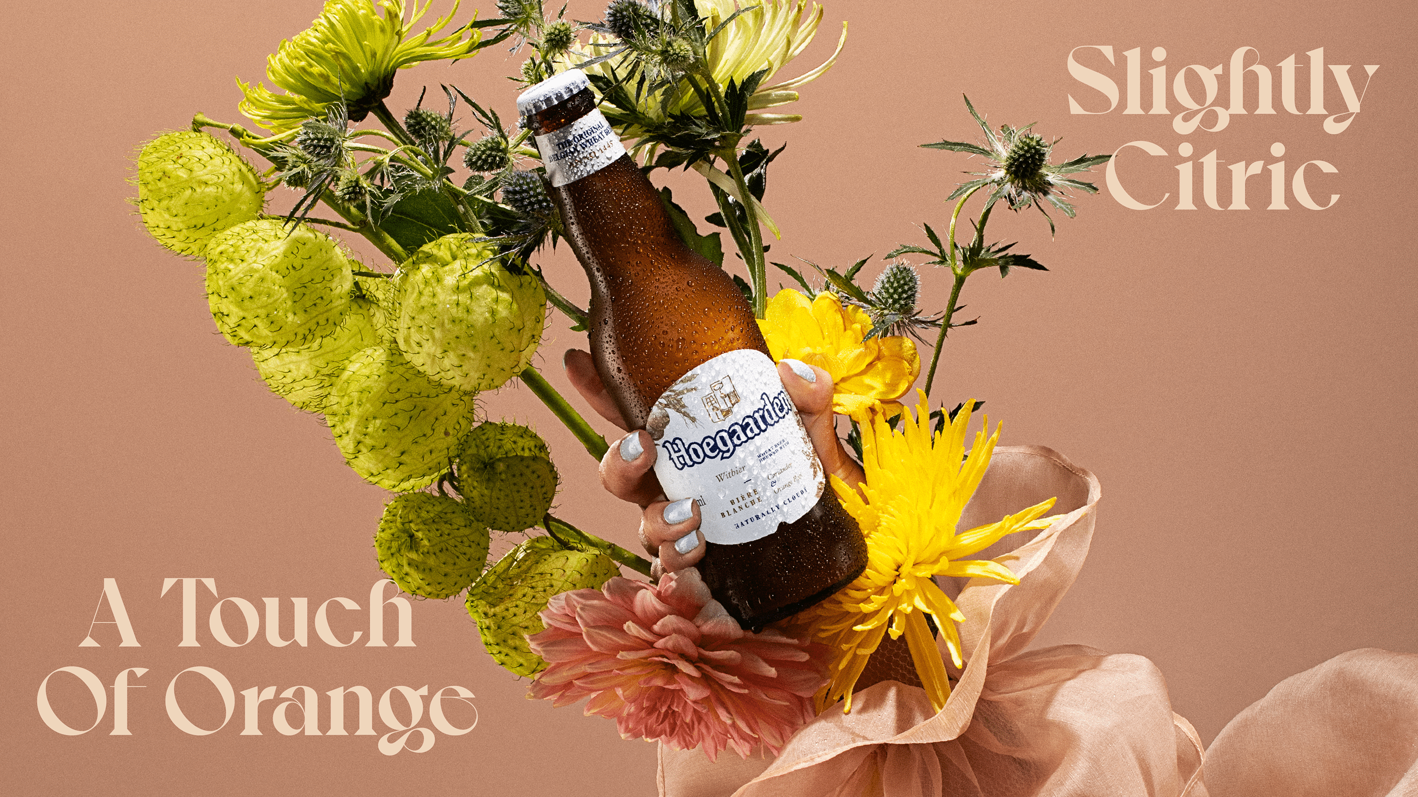
A AB Inbev nos convidou para desenvolver a nova identidade visual global da marca Hoegaarden. Com um novo visual honrando e ampliando seus ativos visuais com base na herança e tradição originais dessa marca icônica, criamos uma nova iconografia ilustrada e levamos o icônico Jardim a uma nova afirmação mais sofisticada, como um lugar inspirador e artístico onde uma natureza sublime e os ingredientes de Hoegaarden são os protagonistas.
Com foco no fortalecimento das conexões com os principais mercados globais, o novo universo simbólico e as novas expressões da Hoegaarden atendem às demandas dos consumidores por momentos de relaxamento e inspiração.
Traduzir o caráter premium e ambicioso da marca por meio de códigos mais contemporâneos e menos românticos aprofunda seu relacionamento com os consumidores, sem comprometer sua história ou os elementos essenciais de sua narrativa estabelecida.
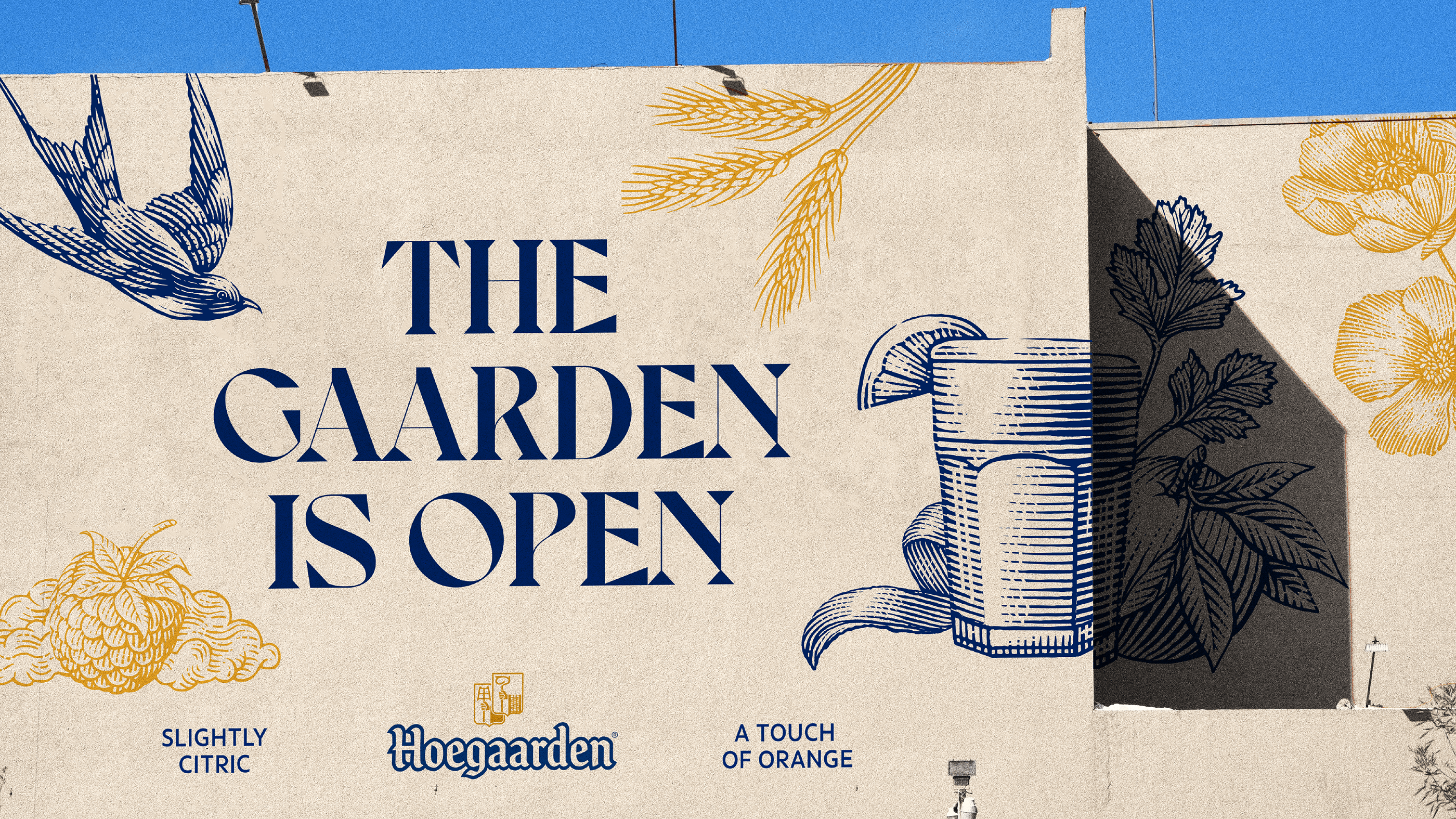
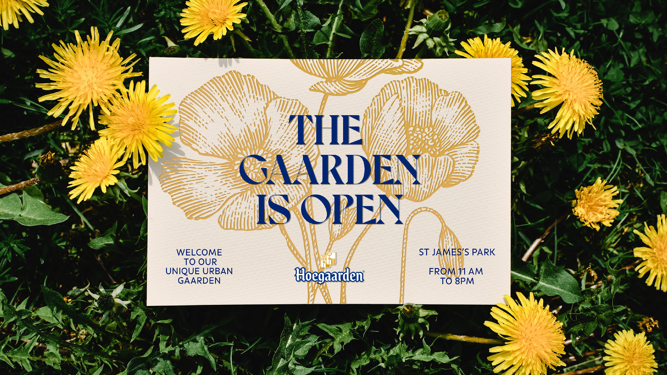
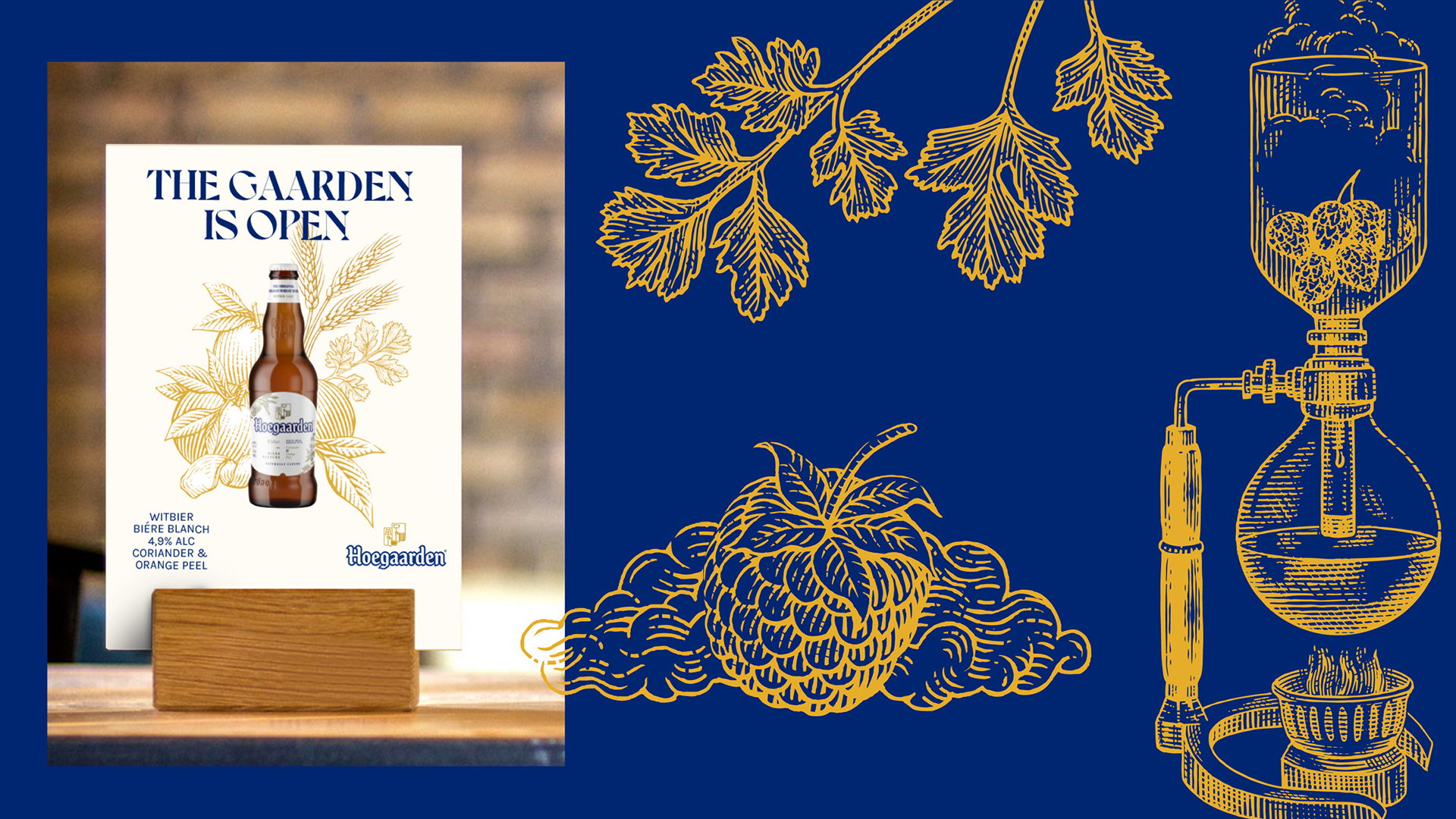
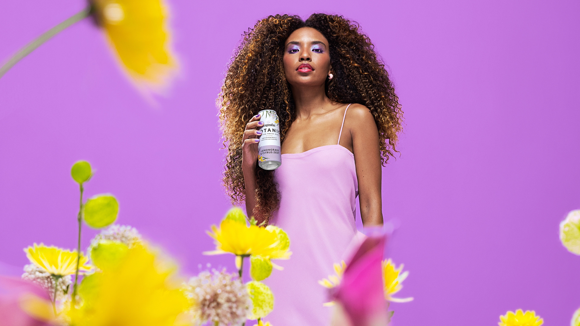
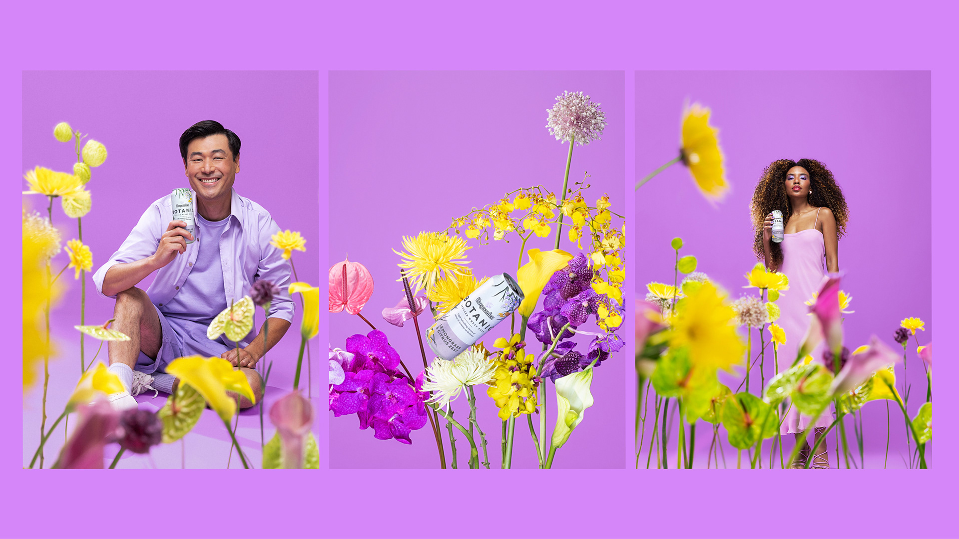
Redefinimos o jardim que a marca carrega em seu próprio nome por meio de uma lente mais moderna e tangível.
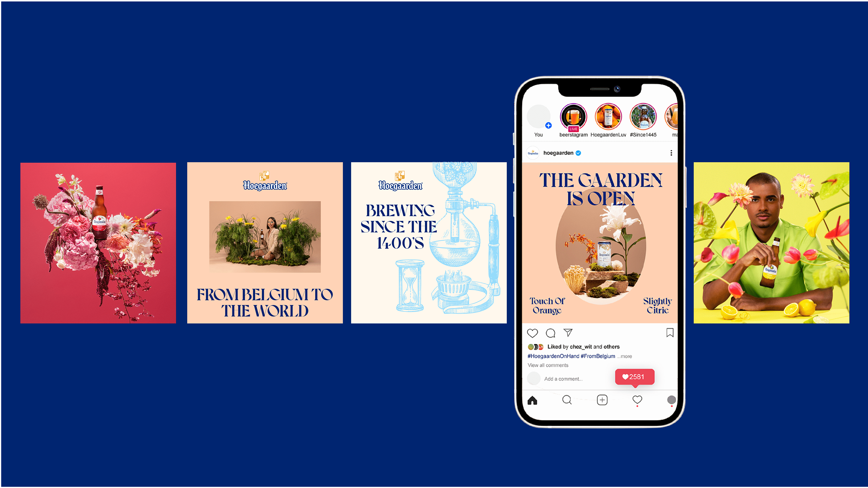
O produto ocupa o centro da narrativa, ligando-o diretamente ao conceito central da marca: é por meio do produto que esse novo e sublime jardim se desdobra e se torna presente na vida dos consumidores, respondendo à sua necessidade genuína de relaxamento e inspiração.
Assim, este não é apenas um jardim em seu sentido mais básico; ao contrário, carrega uma dimensão inerentemente artística e única em sua materialização.
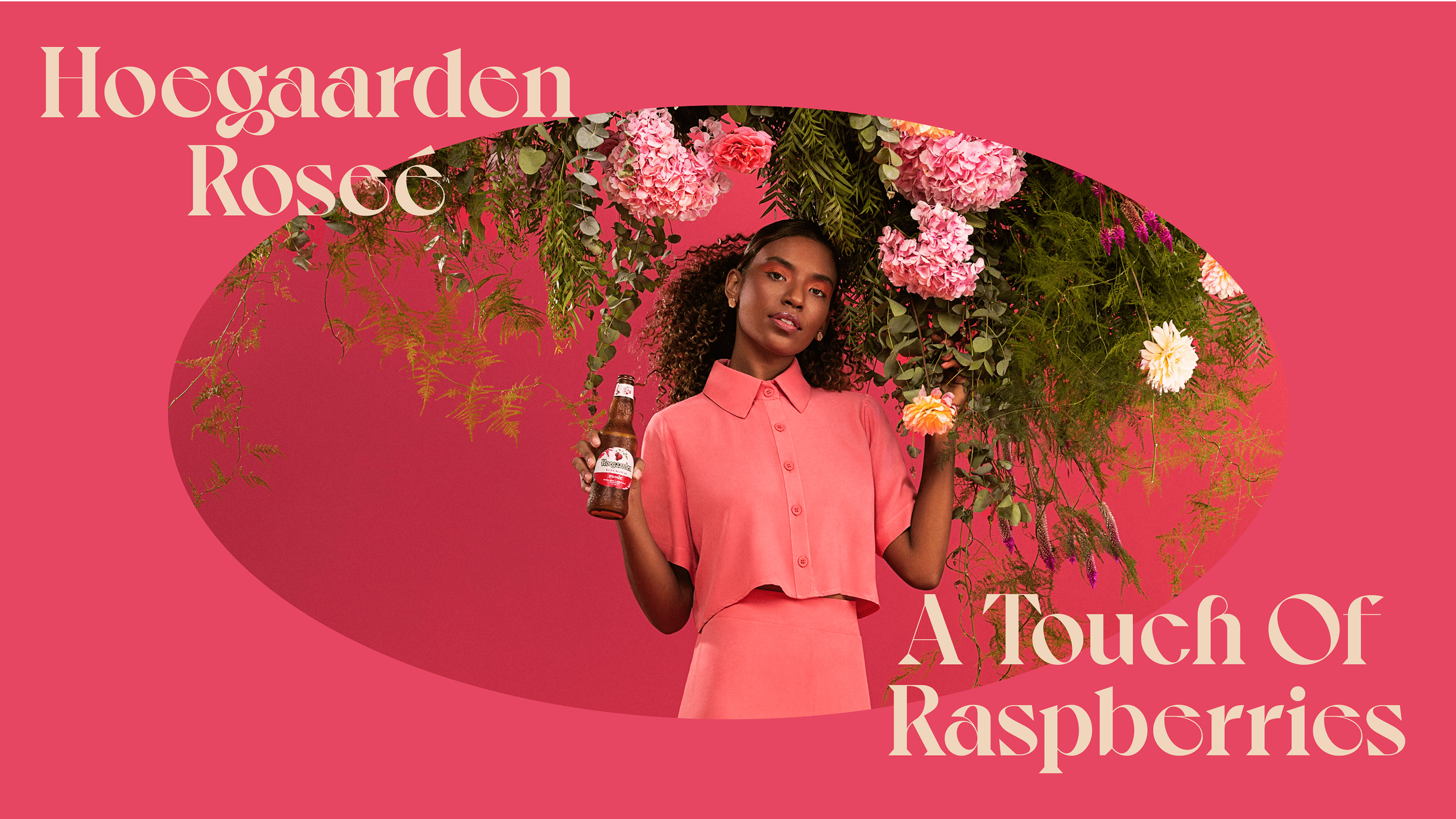
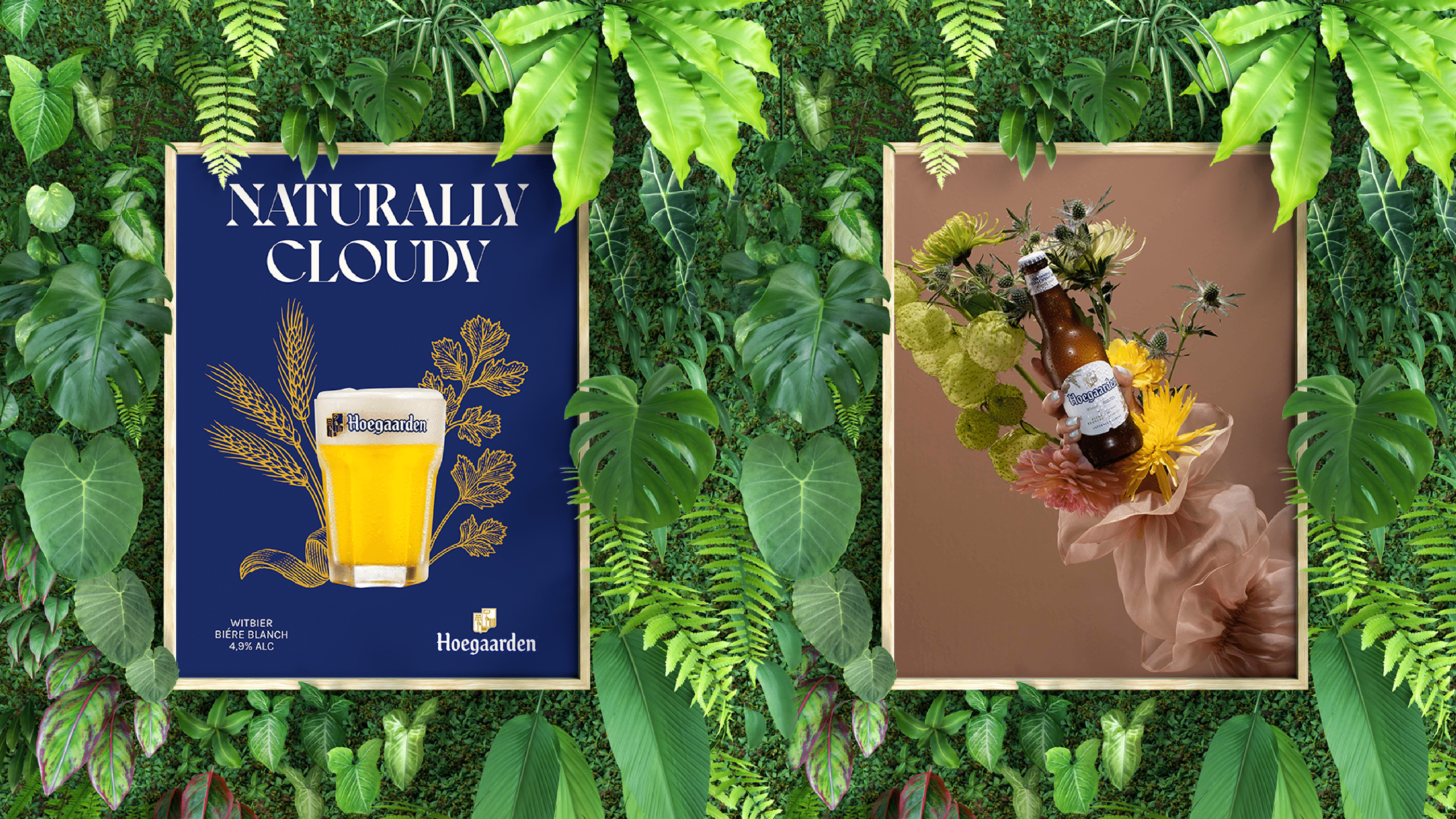
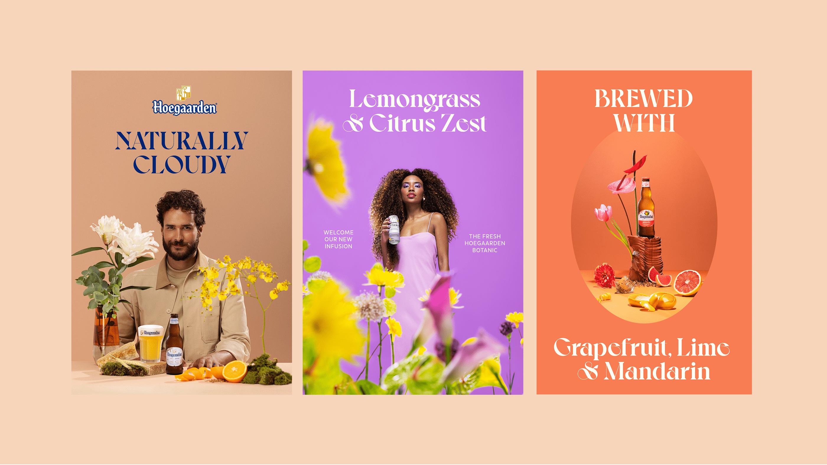
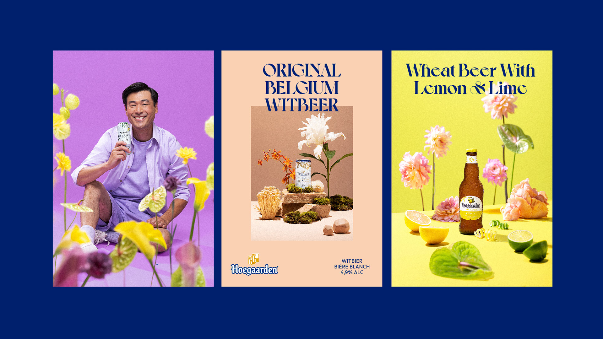
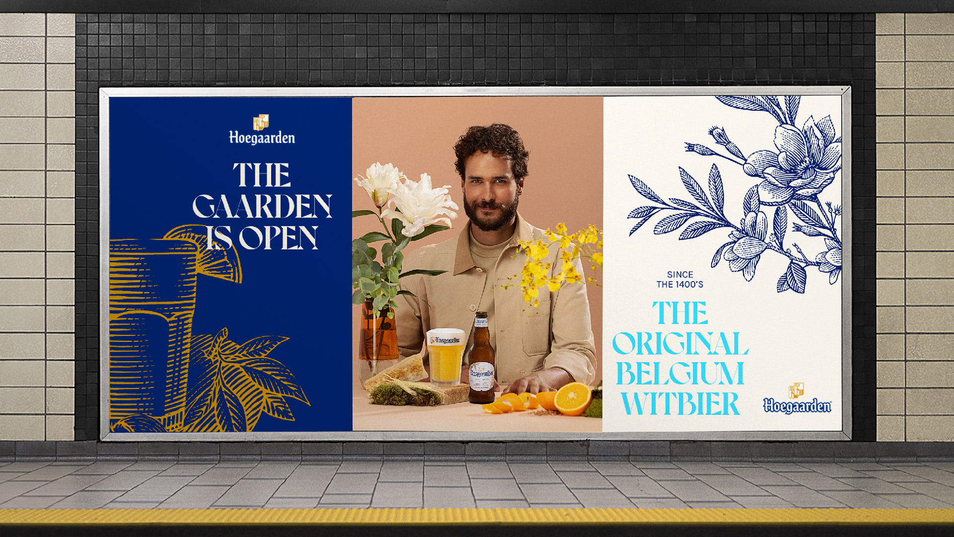
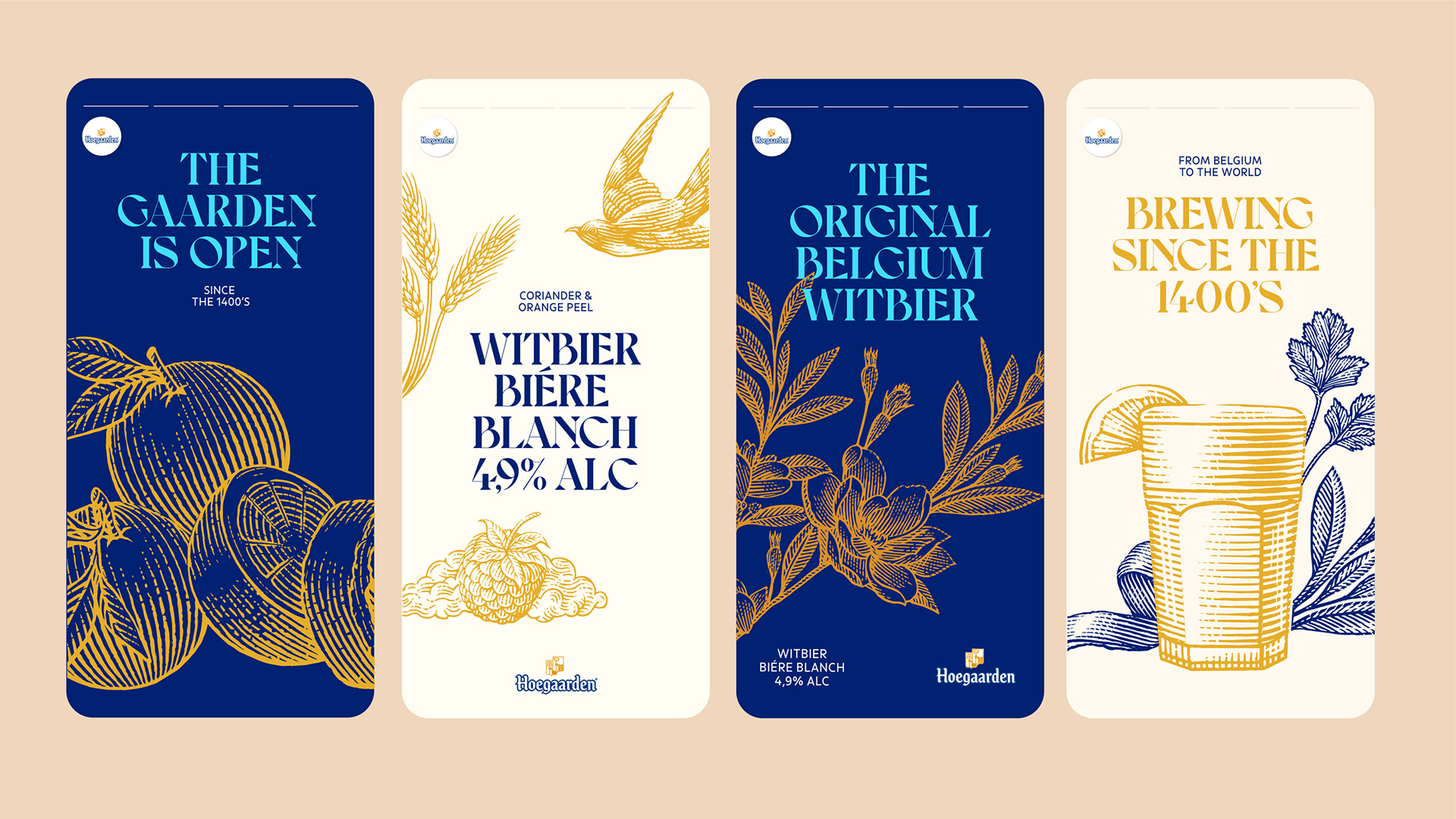
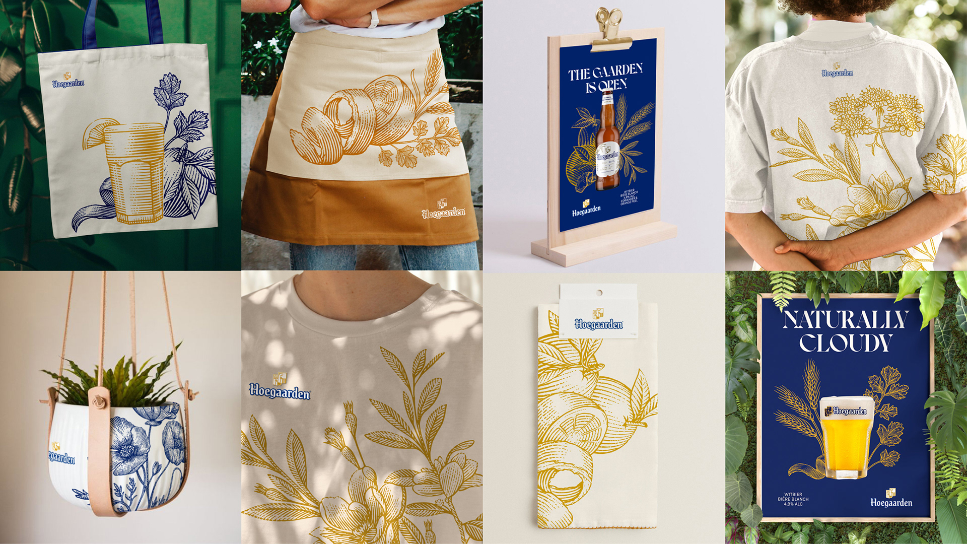
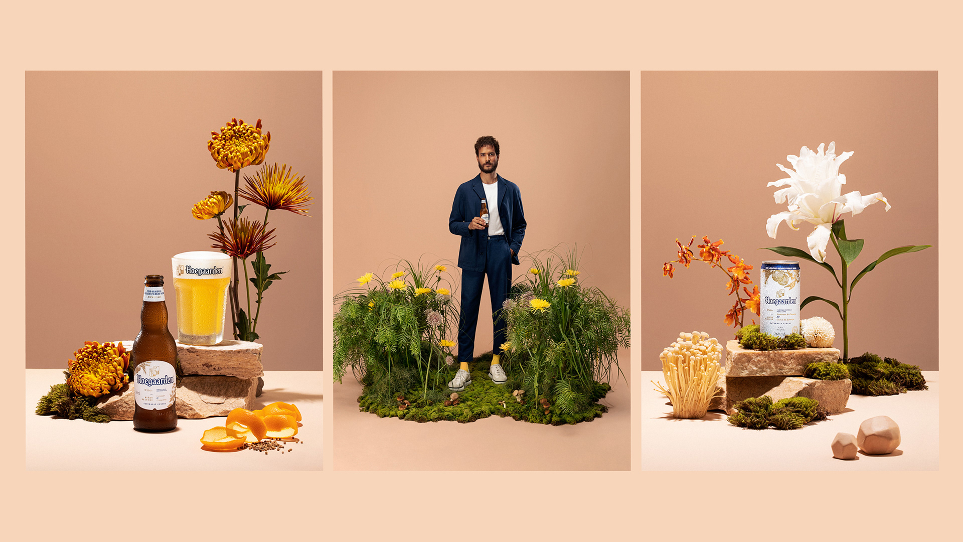
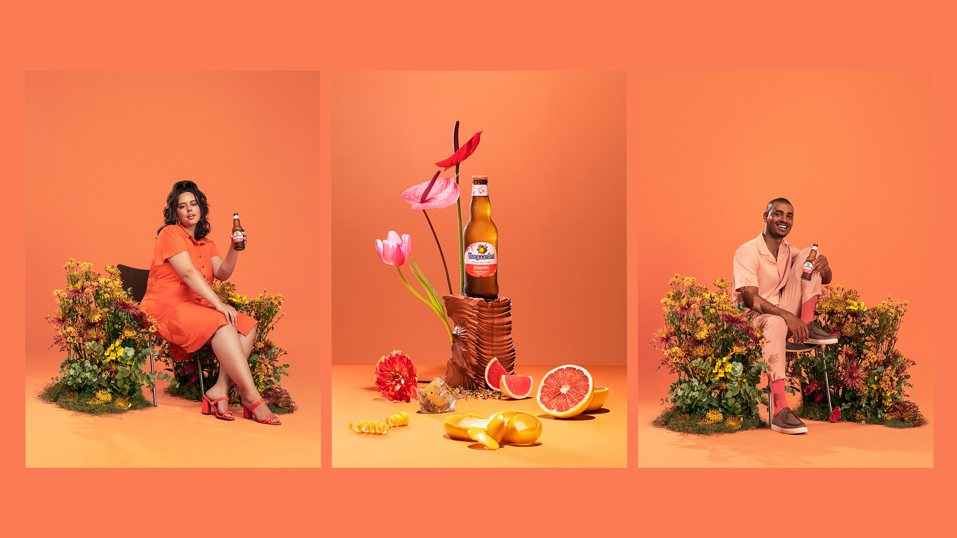
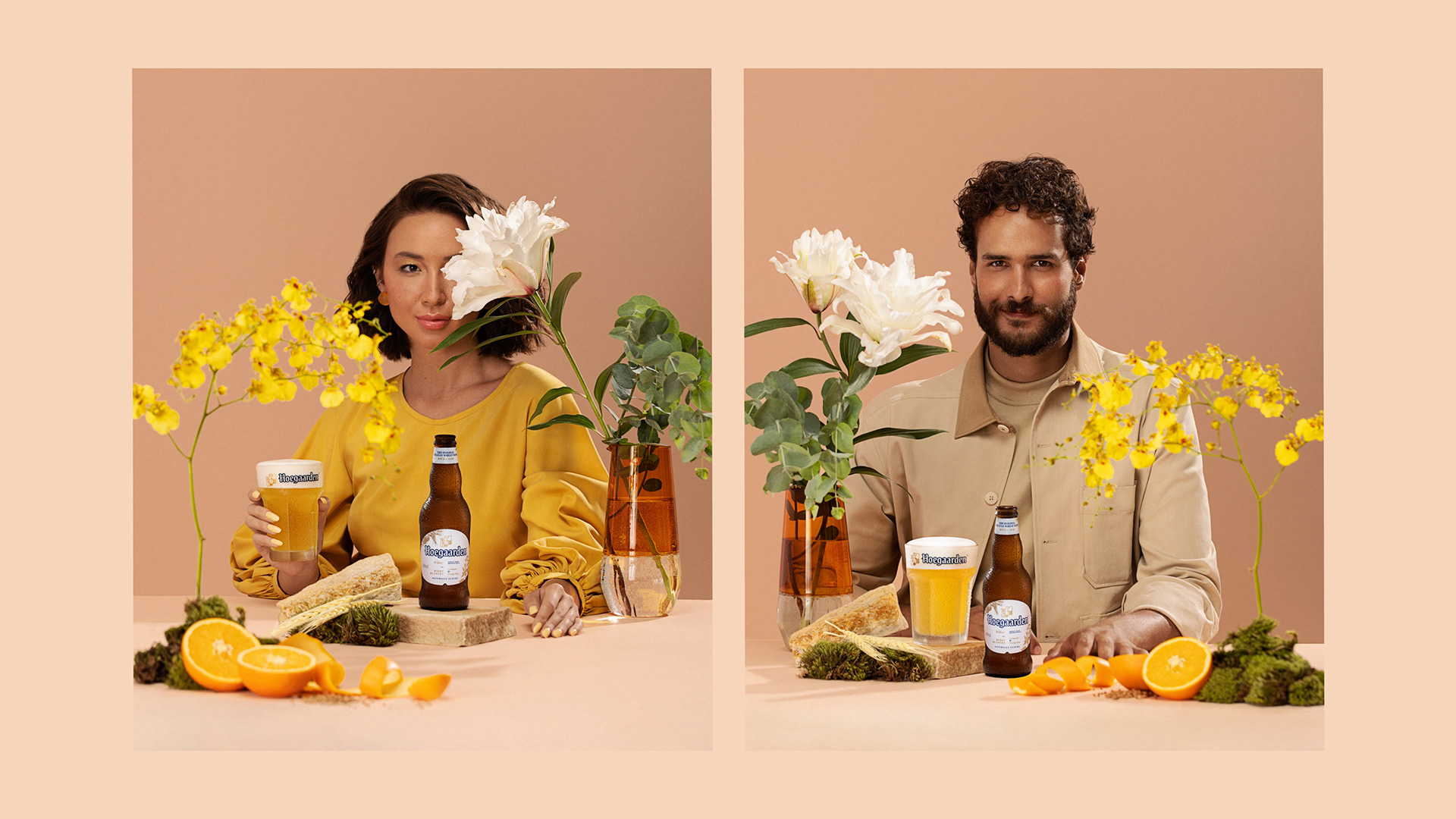
Essa visão se reflete na criação de um novo conjunto de ilustrações, uma direção fotográfica refinada que aprimora as texturas, uma tipografia atualizada e uma paleta de cores expandida, convidando e estimulando uma relação sensorial entre o produto, seus ingredientes e a natureza.
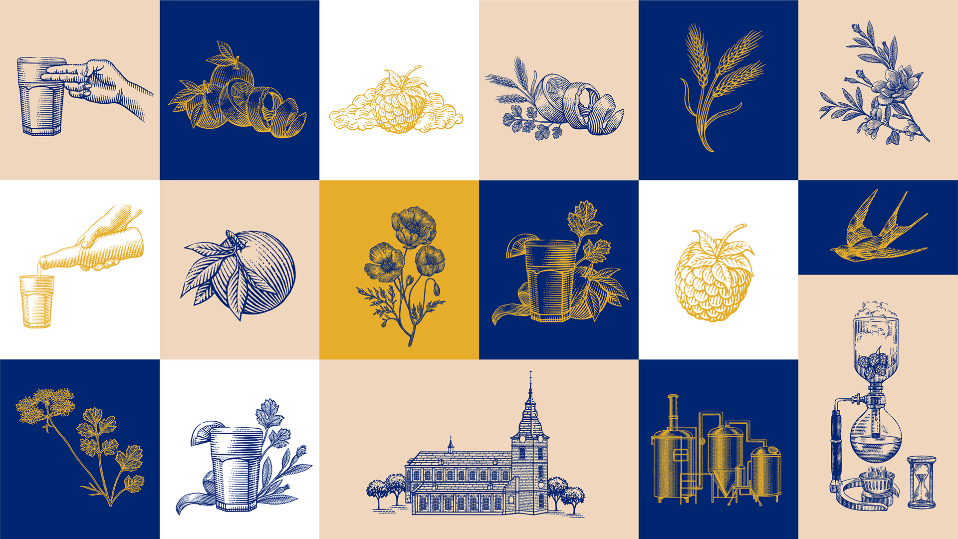
Ilustrações
Partindo da tradição e essência da marca, desenvolvemos uma linguagem ilustrada que agrega valor e amplifica sua presença de forma poderosa e coerente.
Com excelência técnica e uma seleção cuidadosa de elementos, elaborados em estreita colaboração com o cliente, criamos um novo capítulo para a Hoegaarden, que é flexível e se integra perfeitamente a todos os pontos de contato necessários.
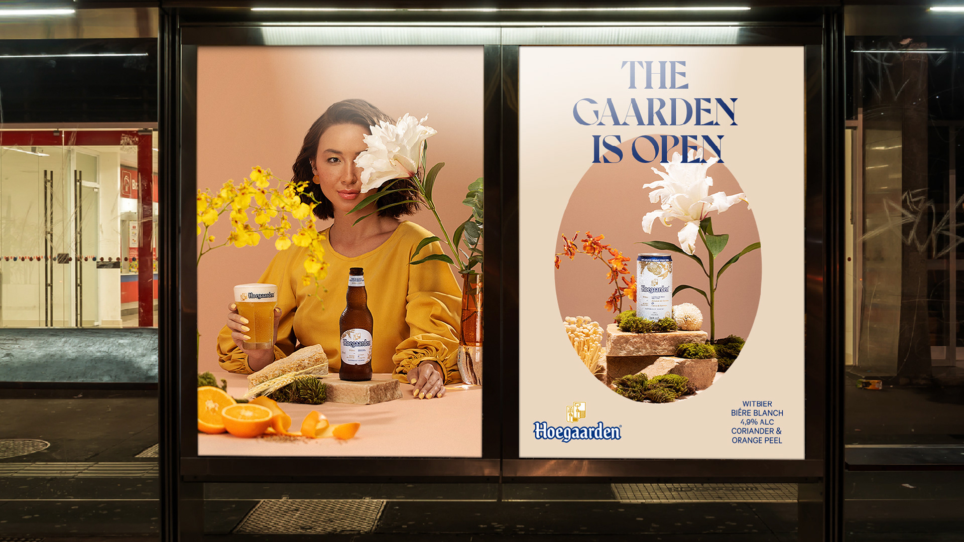
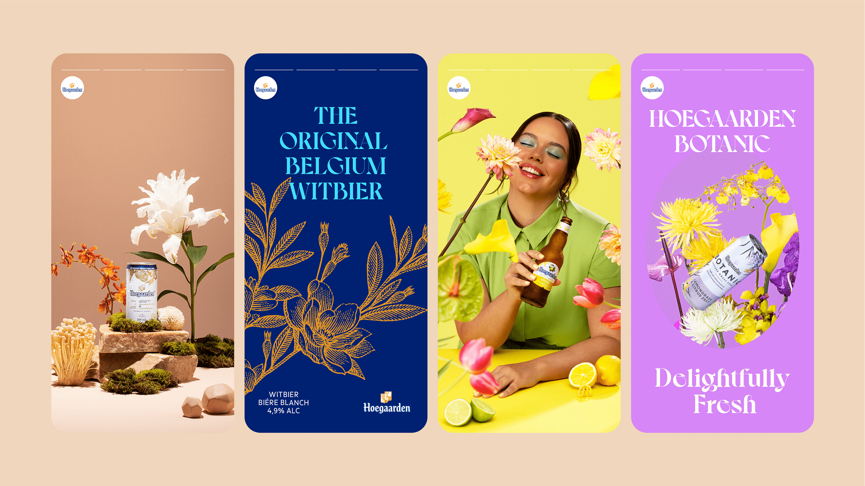
Direção de fotografia
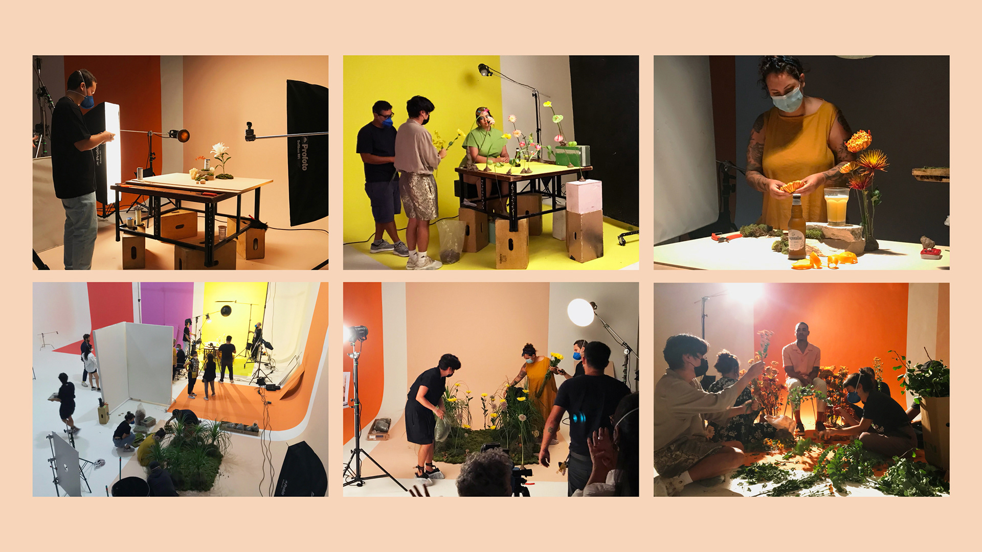
Desenvolvemos uma nova linguagem fotográfica contemporânea para complementar o universo simbólico em evolução da marca.
Para moldar nosso novo jardim, pesquisamos folhas, frutas e flores sazonais, buscando um resultado exuberante e ambicioso. Nossas inspirações vieram diretamente dos aromas e ingredientes de cada produto, que guiaram a atmosfera de cada sabor.
Exploramos cores vibrantes e complementares para enfatizar a presença de cada variedade de cerveja. Cada decisão criativa foi tomada de acordo com o mundo ambicioso da marca, incluindo um elenco mais diversificado e o uso de elementos naturais, resultando em uma direção fotográfica distinta e impactante.
A ousadia é sobre correr riscos e reverter a ordem.Isso é o que o Carnaval representa.
No Carnaval, tudo está em movimento, e a marca também está.
Esta marca tem tanto coreografia quanto ginga.
10 milhões de pessoas impactadas durante o carnaval no Rio.
7.840 pessoas entrevistadas durante o processo.
1 bilhão de dólares em movimentação econômica.


Para garantir que a marca Rio Carnaval fosse viva e orgânica, como o Rio de Janeiro, desenvolvemos — em parceria com o André Burnier e com a Plau— uma ferramenta de programação criativa que permite interagir com a marca a partir do movimento das fitas, das suas espessura, dos seus movimentos, ritmos, cores e que fosse customizável. Uma marca pulsante que tem personalidade, comportamento e que representa a força criativa de todas as Escolas de Samba.

PONTOS DE MÍDIA
Distribuídos em 4 regiões
do Rio e 3 cidades da
Baixada Fluminense.
inserções da campanha
4.433.436 inserções publicitárias veiculadas.
DE IMPACTOS SEMANAIS
60 milhões de
pessoas impactadas
em diferentes canais.