
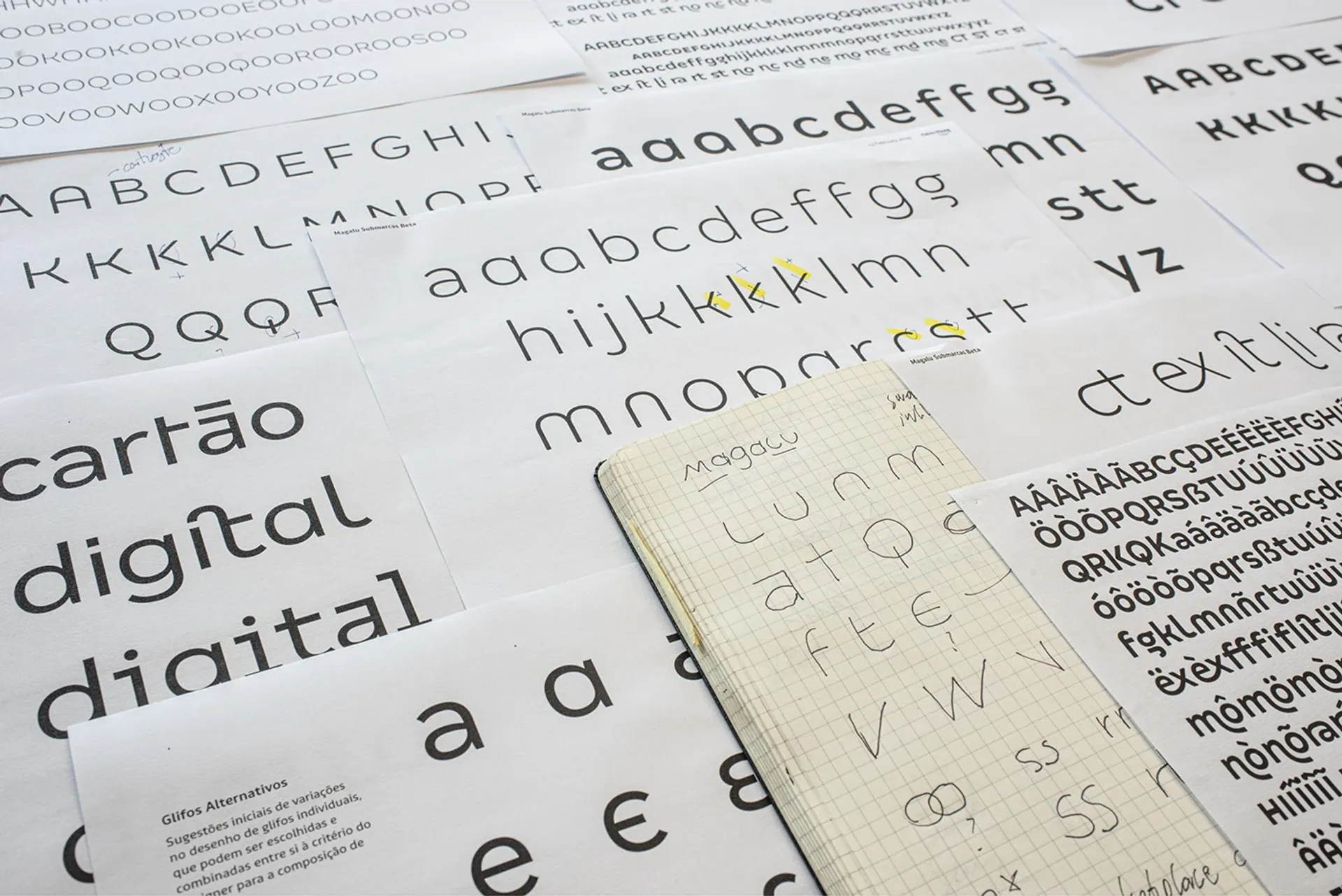
It all began in the logotype, the epicenter of the entire identity. The reduction of the name from ‘Magazine Luiza’ to only ‘Magalu’ was solved by Tátil by proposing small caps (reduced-size uppercases) in the letters ‘M’ and ‘L’. Fabio Haag Type explored variations in a few rounds of development with Tátil’s designers and refined to the smallest detail the approved version. From there, a typographic palette with three families was designed, each one with its reason for being: Magalu Títulos, Magalu Textos, and Magalu Submarcas.
It all began in the logotype, the epicenter of the entire identity. The reduction of the name from ‘Magazine Luiza’ to only ‘Magalu’ was solved by Tátil by proposing small caps (reduced-size uppercases) in the letters ‘M’ and ‘L’. Fabio Haag Type explored variations in a few rounds of development with Tátil’s designers and refined to the smallest detail the approved version. From there, a typographic palette with three families was designed, each one with its reason for being: Magalu Títulos, Magalu Textos, and Magalu Submarcas.

Magalu Submarcas solves a practical client need: it allows its internal design team to create new sub-brands – be it for a new product or service – quickly, easily and always integrated into Magalu’s visual universe. They achieve this through 3 styles of Magalu Submarcas, which replicate the design present in the logotype, plus, offer a variety of alternative designs and special ligatures. It’s possible to give a unique charm to any word while maintaining Magalu’s brand voice.
Magalu Submarcas solves a practical client need: it allows its internal design team to create new sub-brands – be it for a new product or service – quickly, easily and always integrated into Magalu’s visual universe. They achieve this through 3 styles of Magalu Submarcas, which replicate the design present in the logotype, plus, offer a variety of alternative designs and special ligatures. It’s possible to give a unique charm to any word while maintaining Magalu’s brand voice.
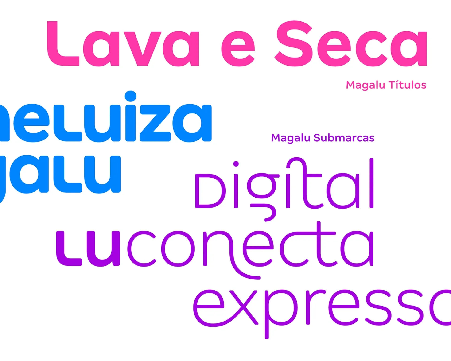
Magalu Títulos have compact spacing and reduced vertical proportions, which allow the creation of strong and compact headlines. Small Caps provide even more density, when necessary, at the designer’s discretion. Magalu Textos brings small changes prioritizing legibility at small sizes, including traditional ‘a’, as well as general changes in the proportions of each glyph, including diacritics.
Magalu Títulos have compact spacing and reduced vertical proportions, which allow the creation of strong and compact headlines. Small Caps provide even more density, when necessary, at the designer’s discretion. Magalu Textos brings small changes prioritizing legibility at small sizes, including traditional ‘a’, as well as general changes in the proportions of each glyph, including diacritics.