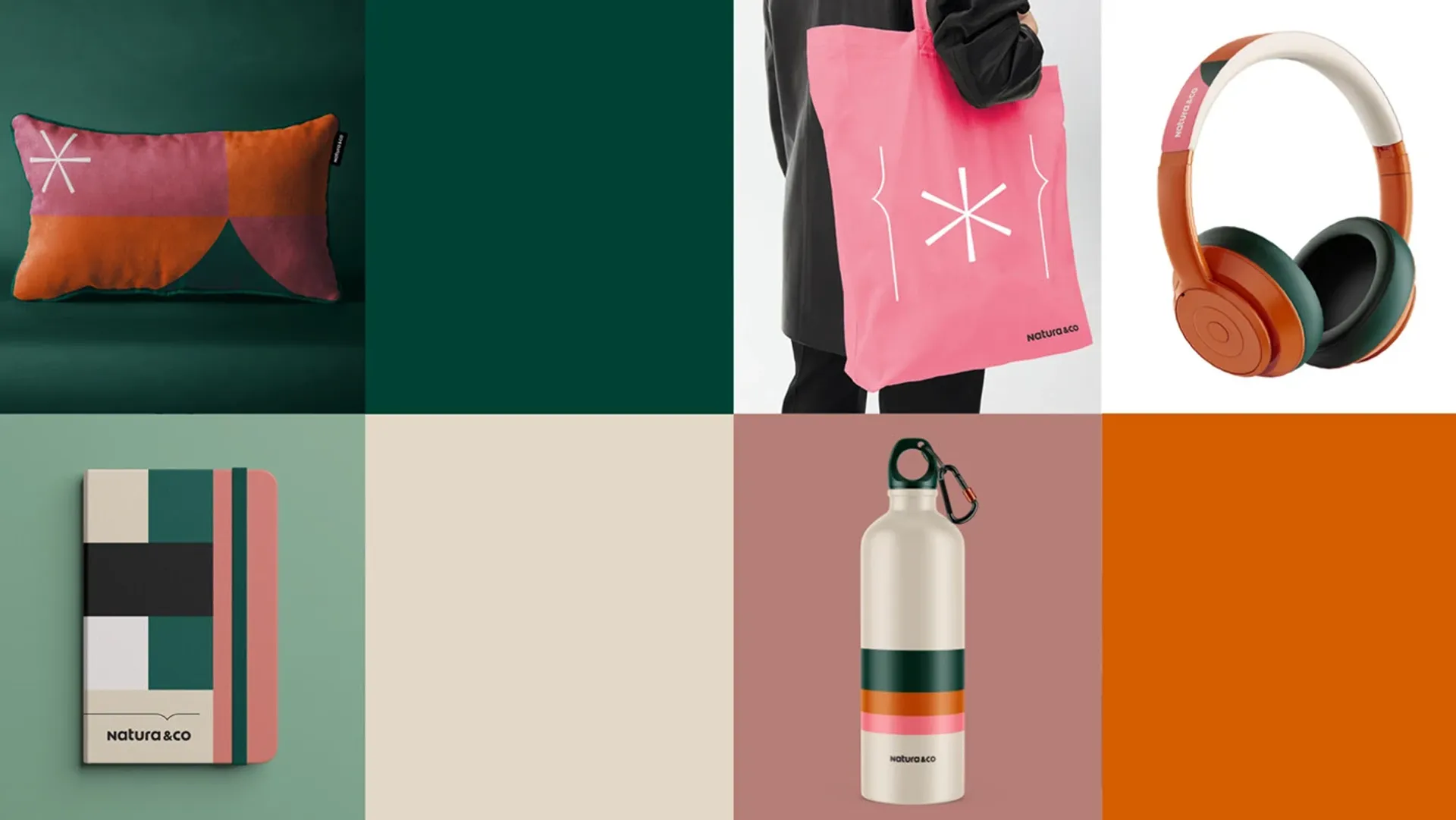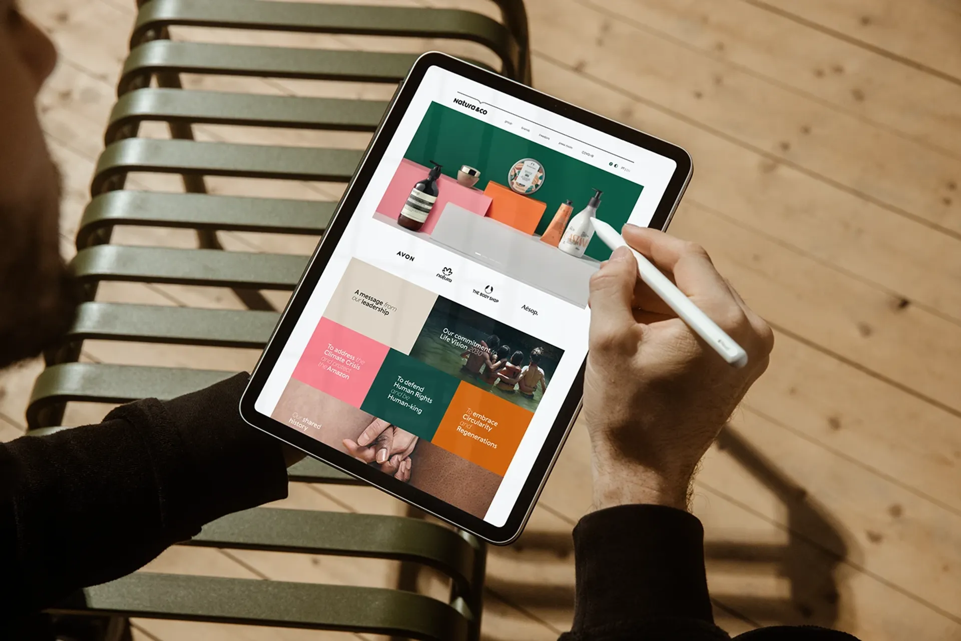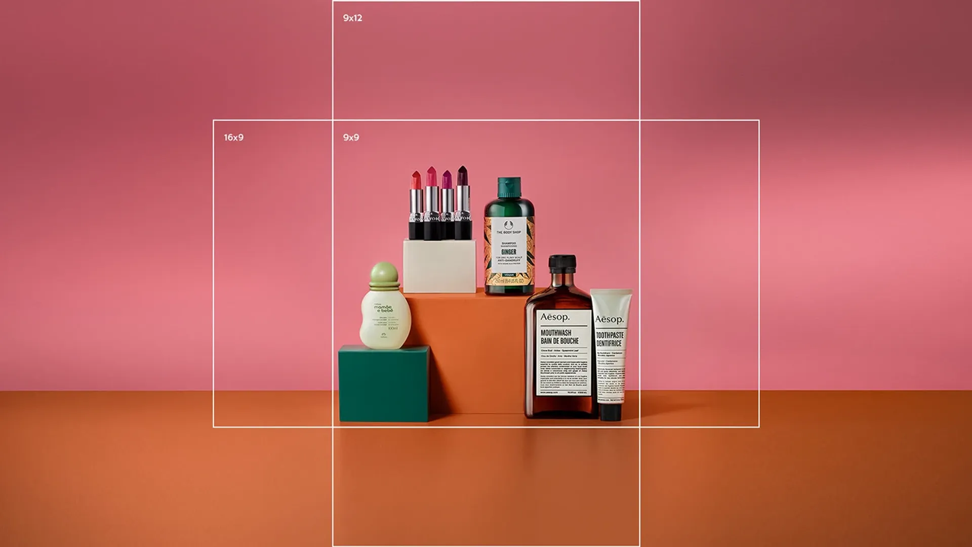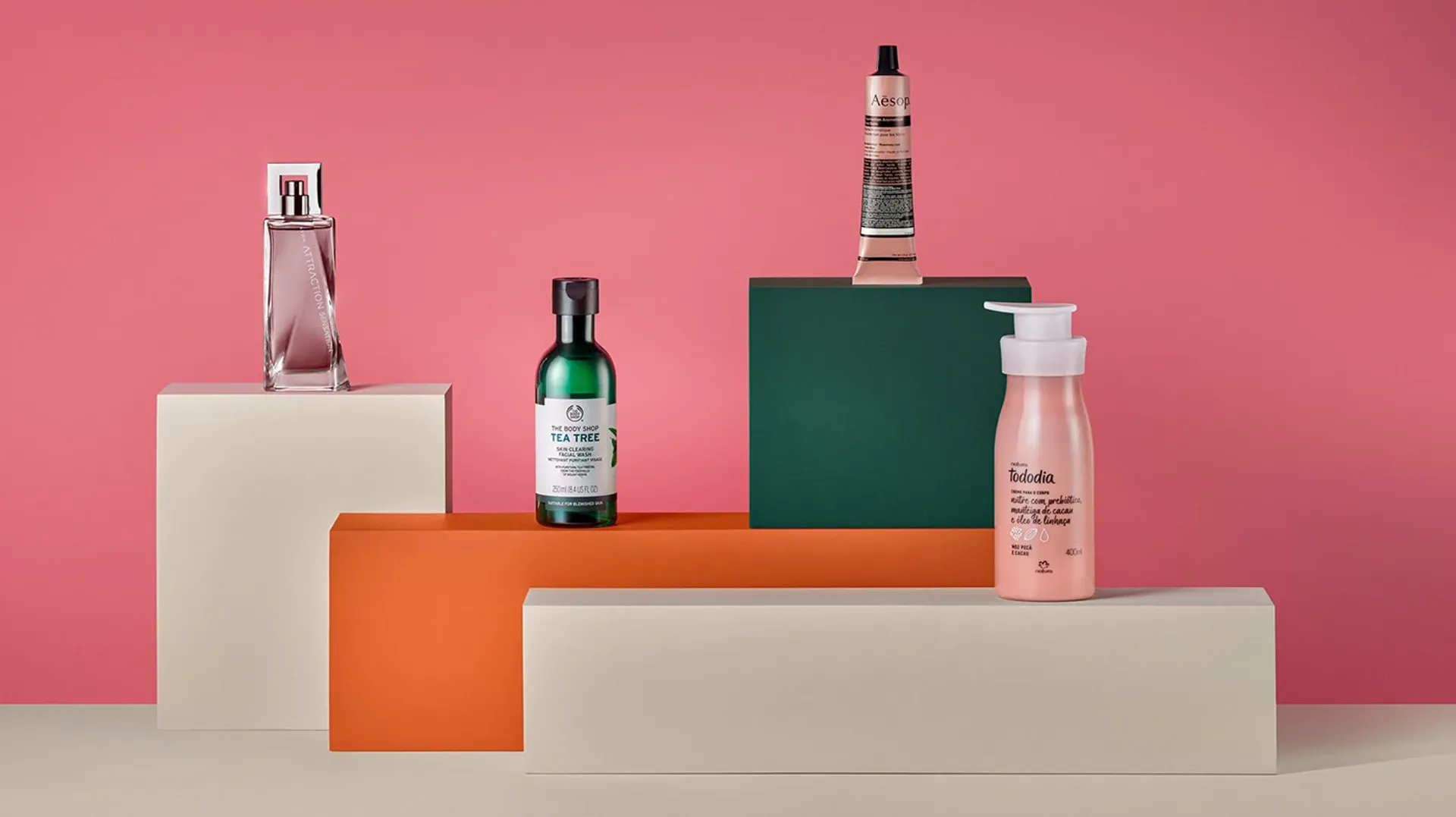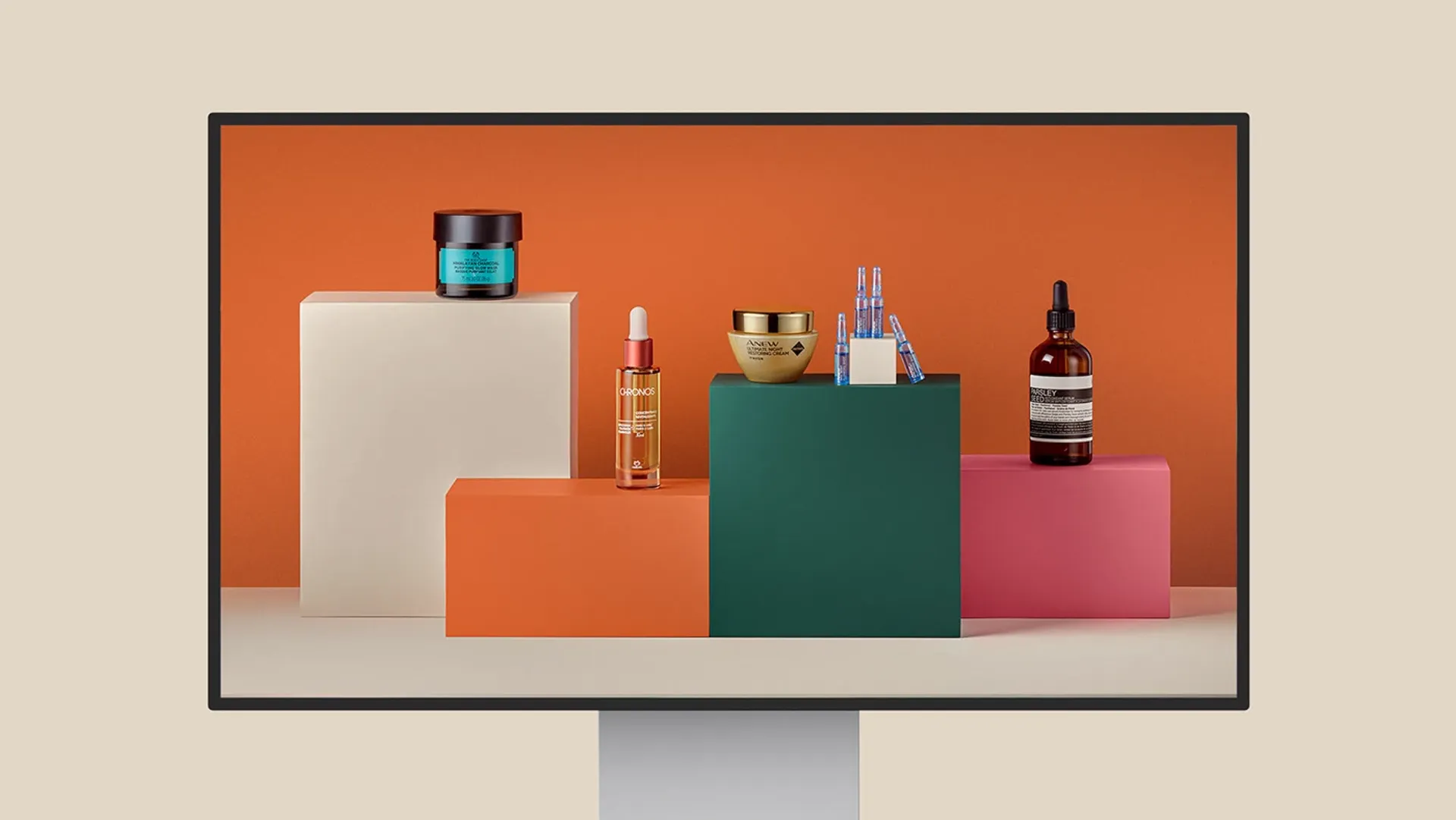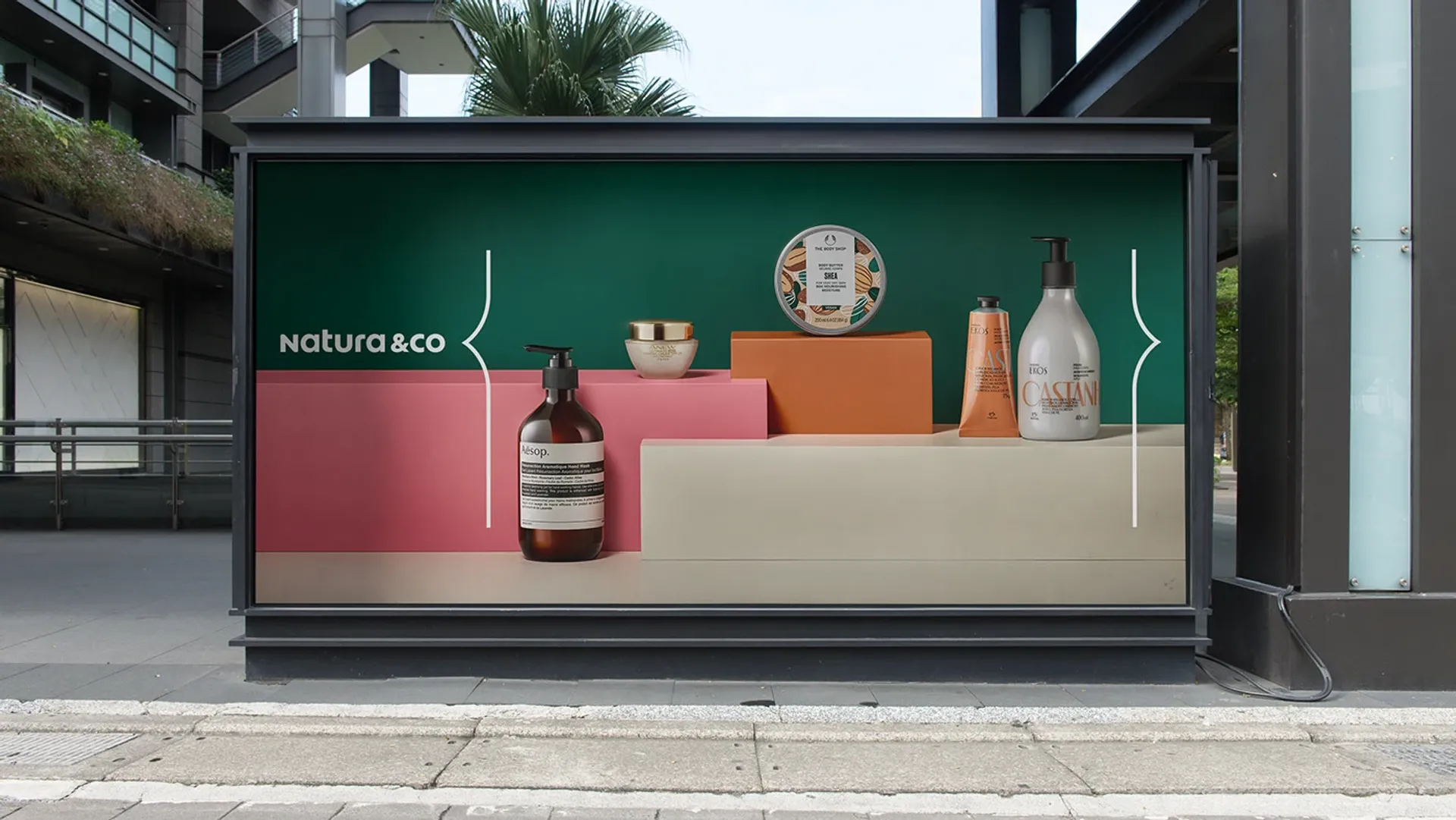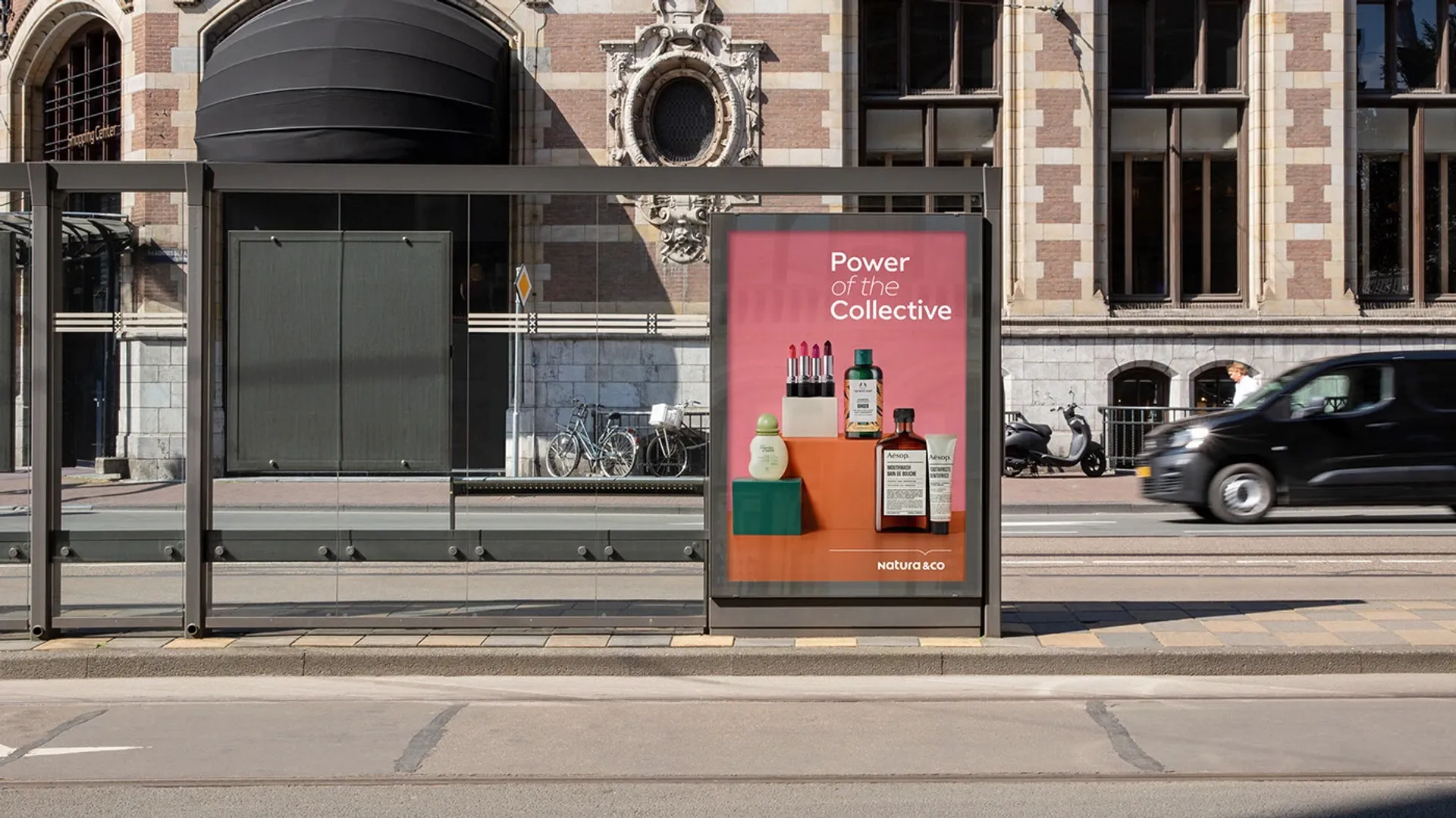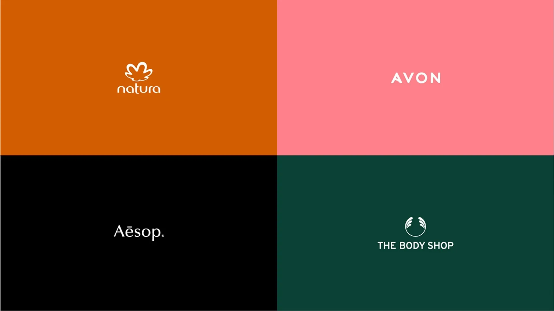
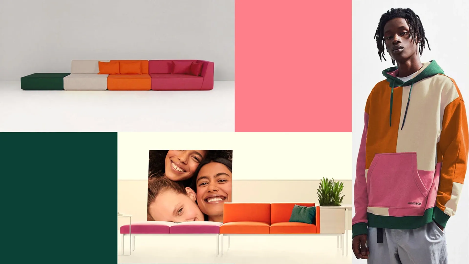


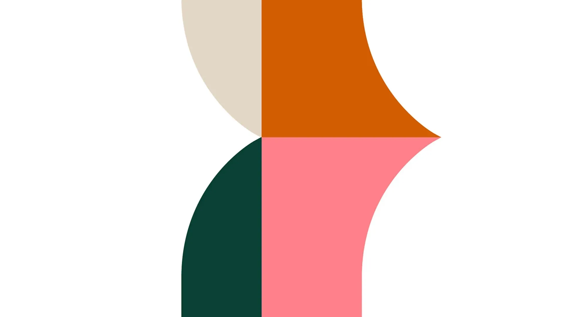
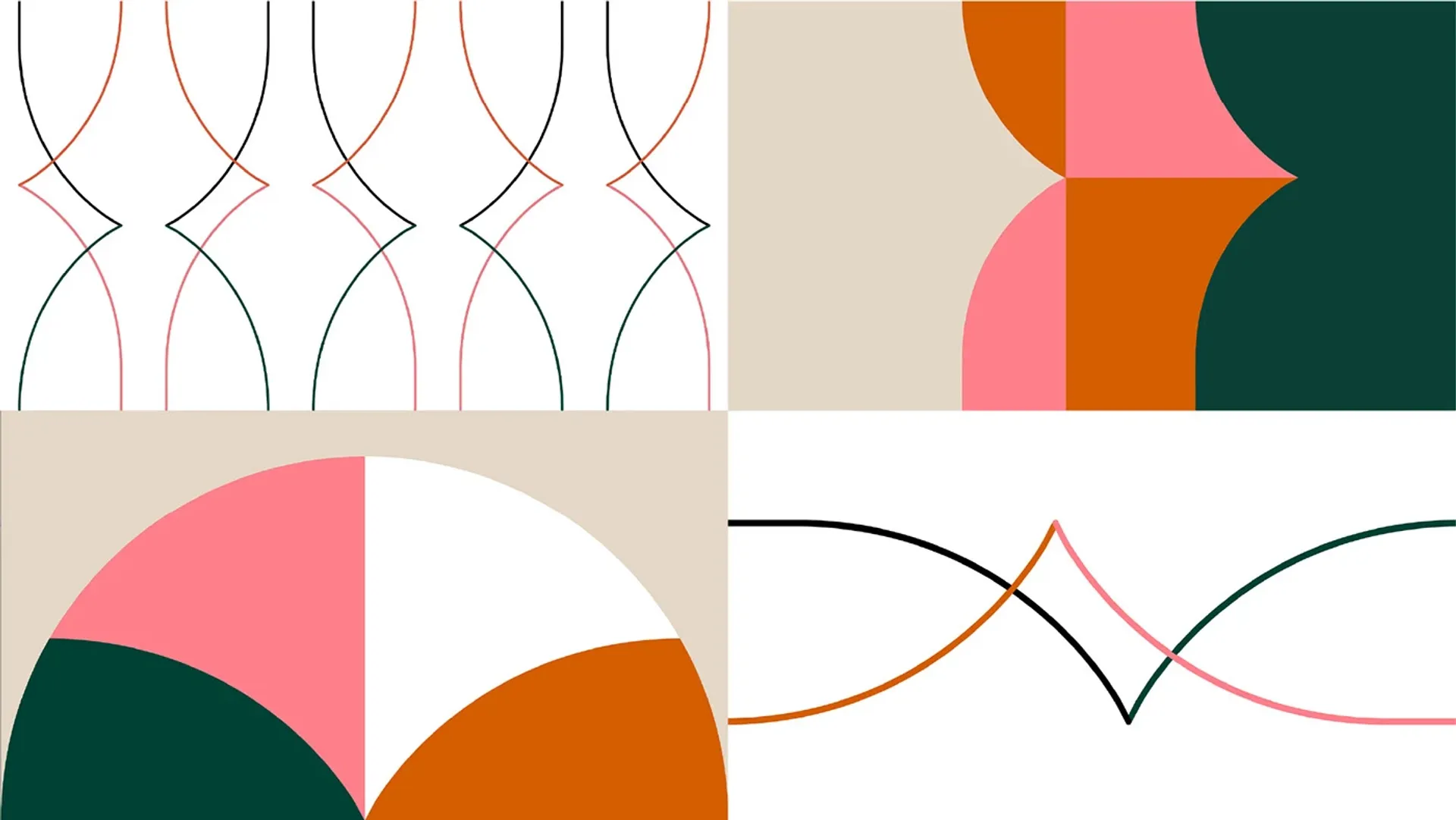
Based on the brand attributes, we created a language that represents the power of the collective: colors that represent each brand within the group and expand into secondary palettes to form a cohesive and contemporary system. This structure is built on a multiple-of-four grid, representing the four brands and adapting to different formats.
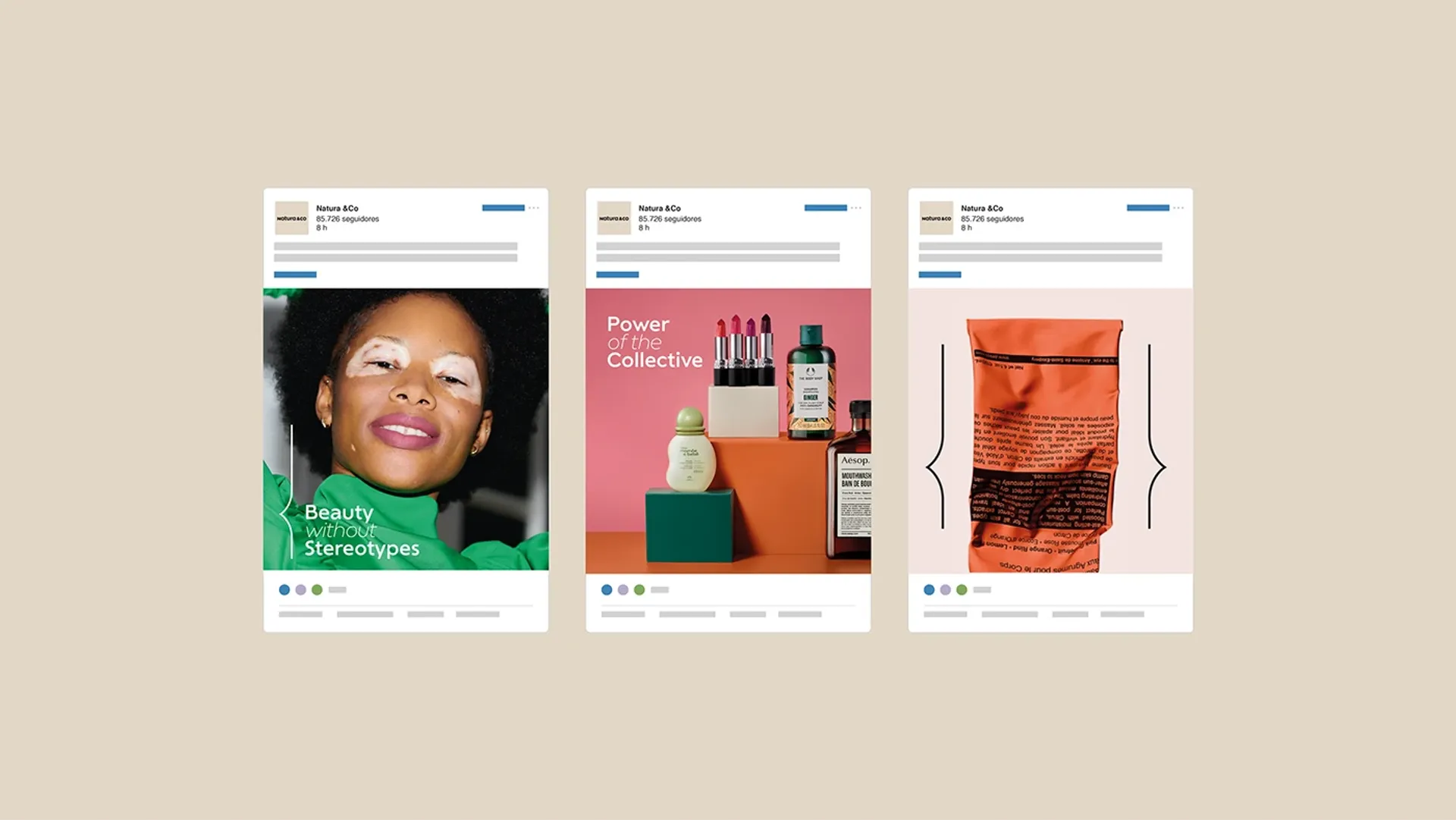
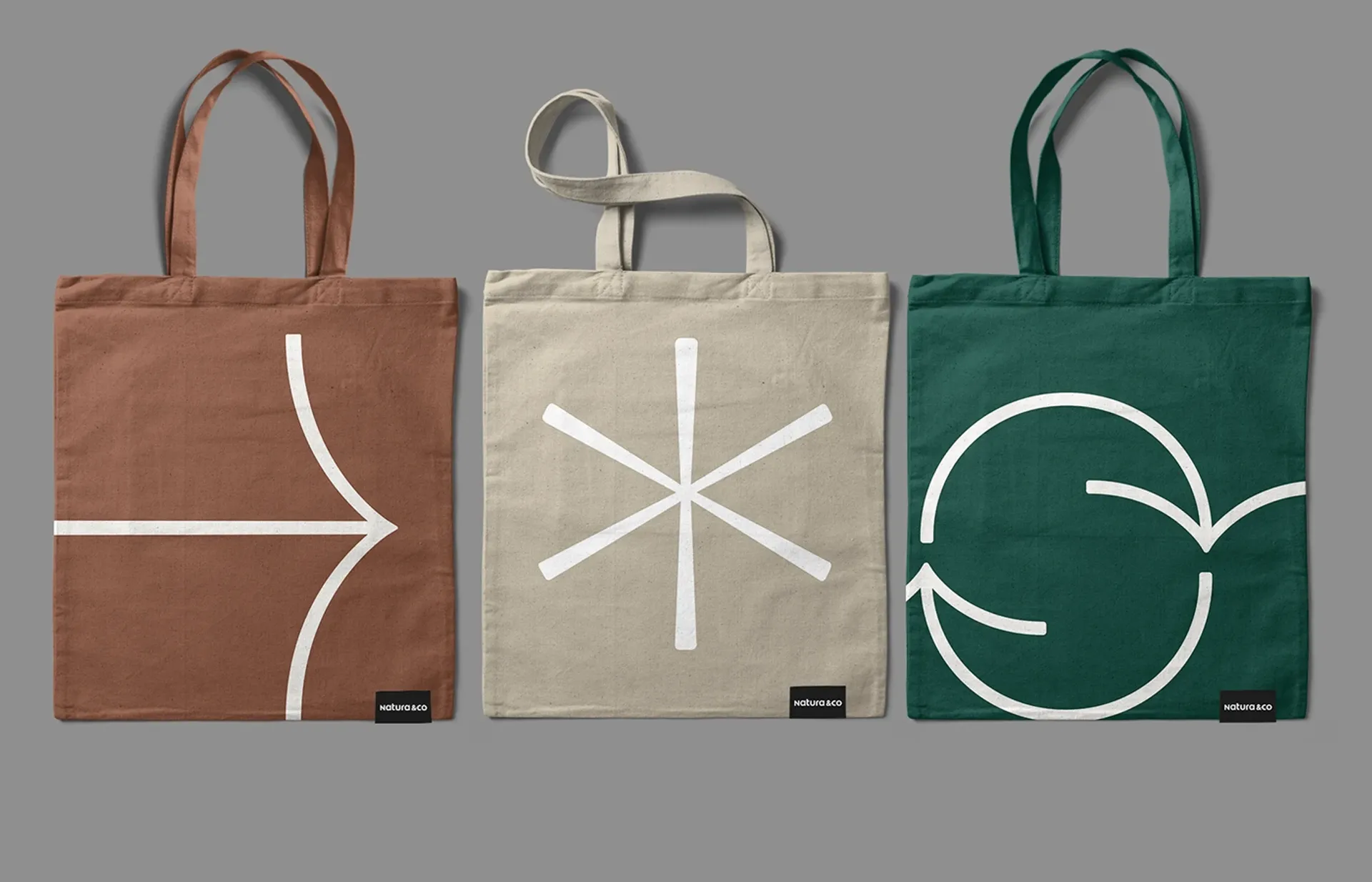
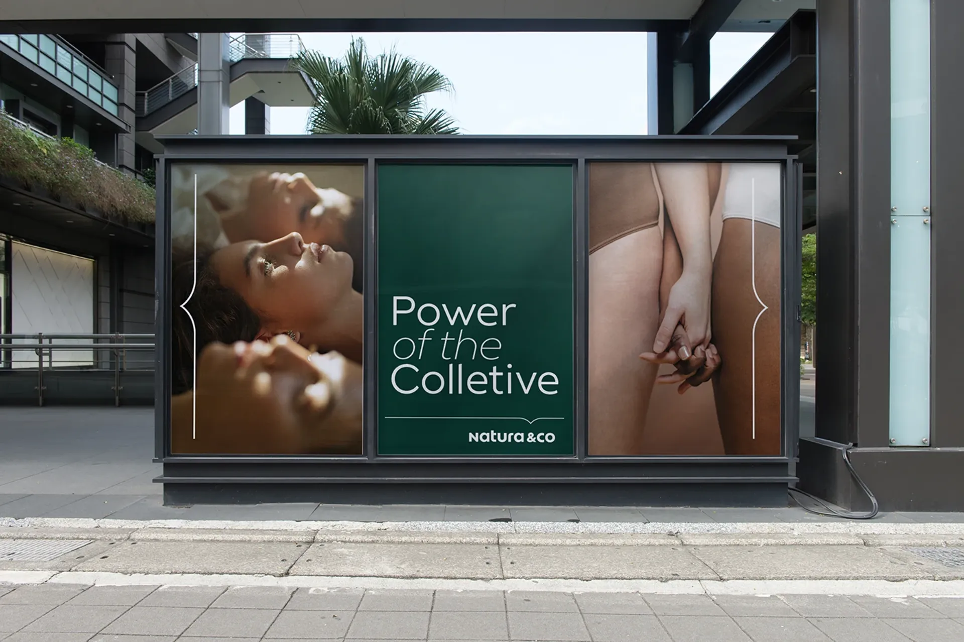
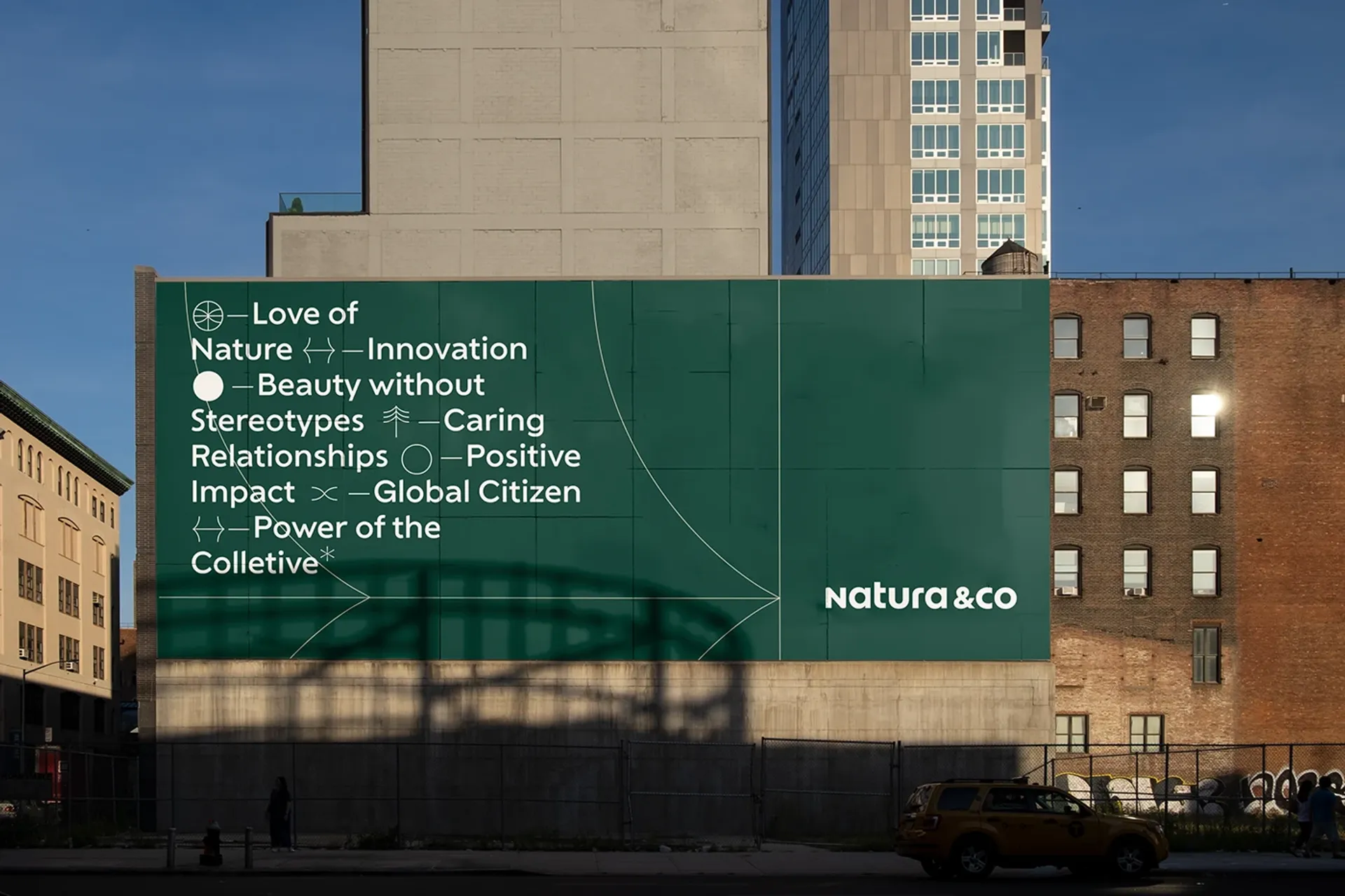
In typography — already a proprietary asset of the brand — we introduced combinations that express diversity and collectivity. Typographic icons were created to complement the existing graphic language and represent Natura &Co’s themes, adding flexibility to the system.
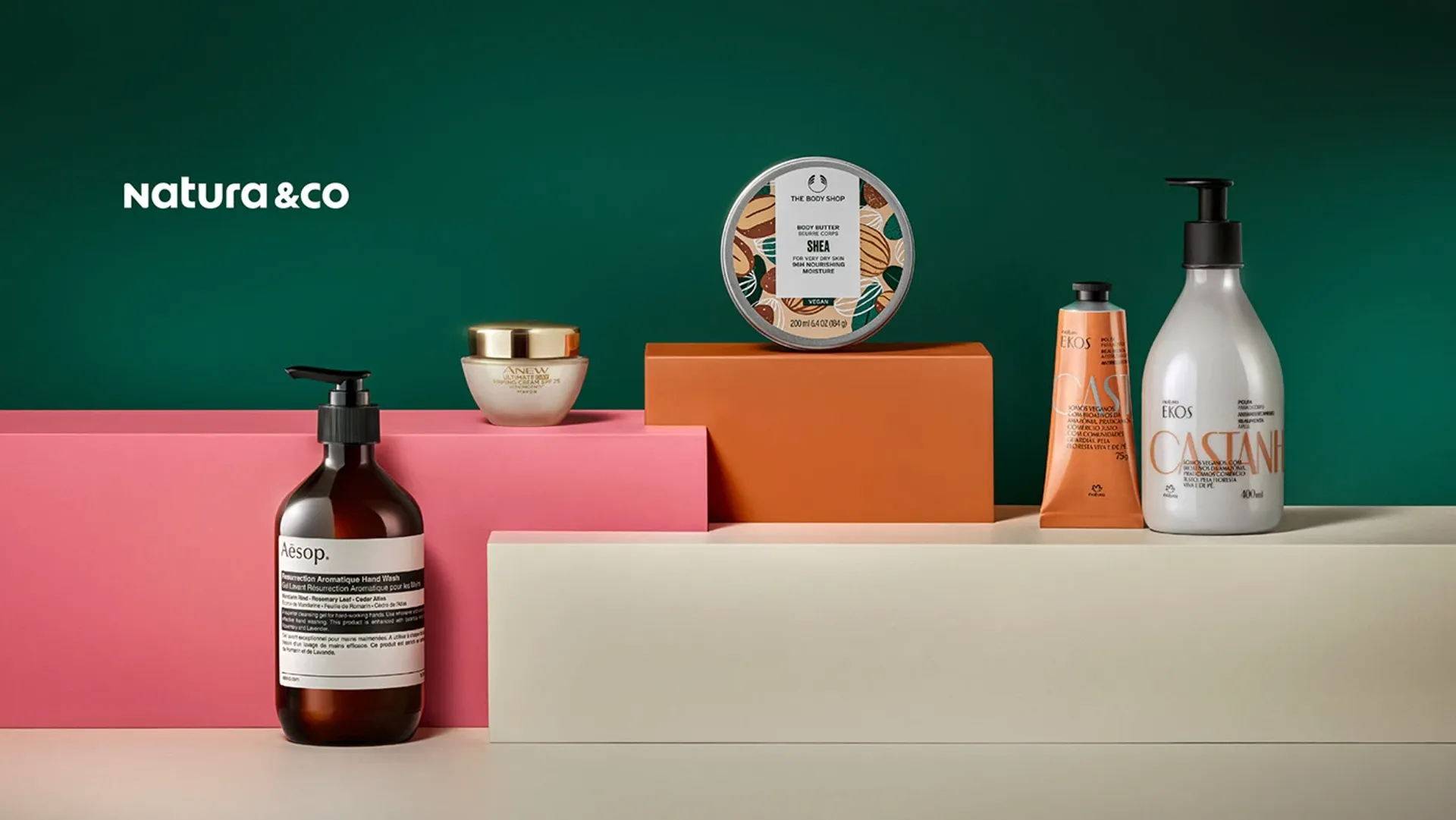
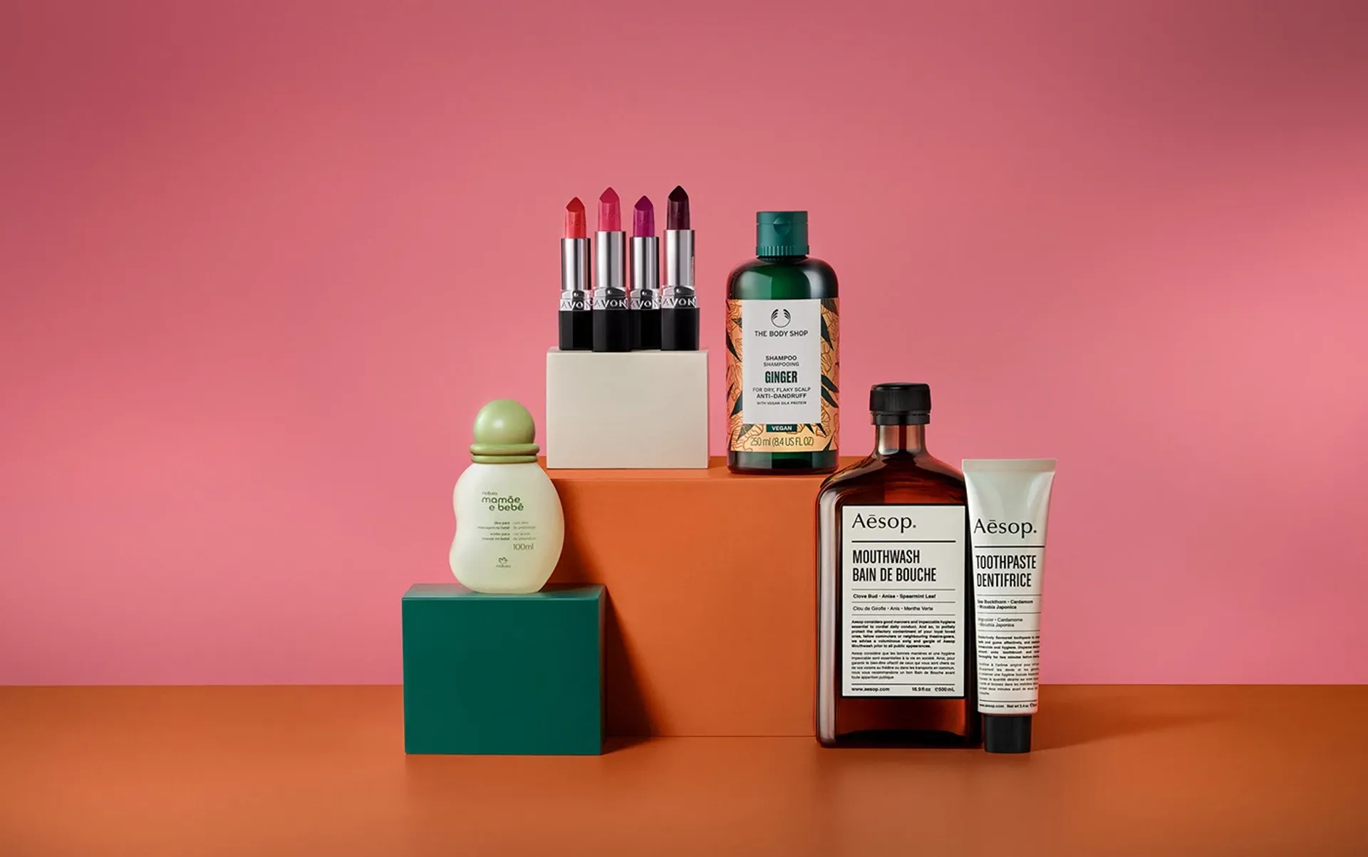
Based on the brand attributes, we created a language that represents the power of the collective: colors that represent each brand within the group and expand into secondary palettes to form a cohesive and contemporary system. This structure is built on a multiple-of-four grid, representing the four brands and adapting to different formats.
In typography — already a proprietary asset of the brand — we introduced combinations that express diversity and collectivity. Typographic icons were created to complement the existing graphic language and represent Natura &Co’s themes, adding flexibility to the system.