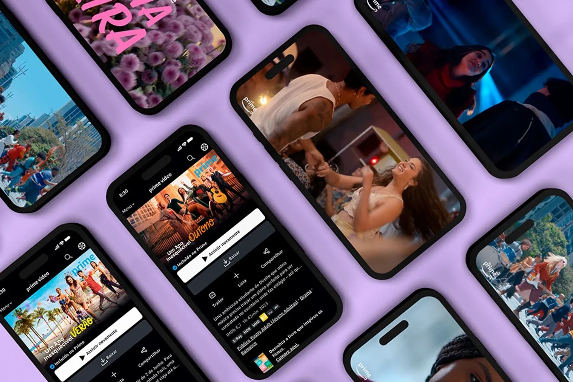


Key Arts System
To translate the personality of each story, building unity for the ensemble while respecting the diversity among the movies, we created a language system based on three attributes: phygital world, young power, and unity with diversity. We aimed to understand the project's release phases at each touchpoint, constructing the Key Arts around key elements that helped tell the narrative of each film in an iconic and authentic way.


Creative Process
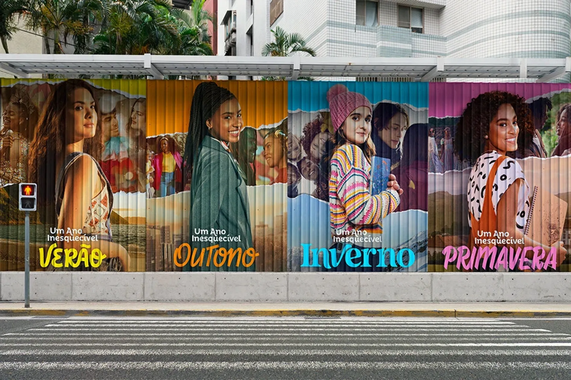
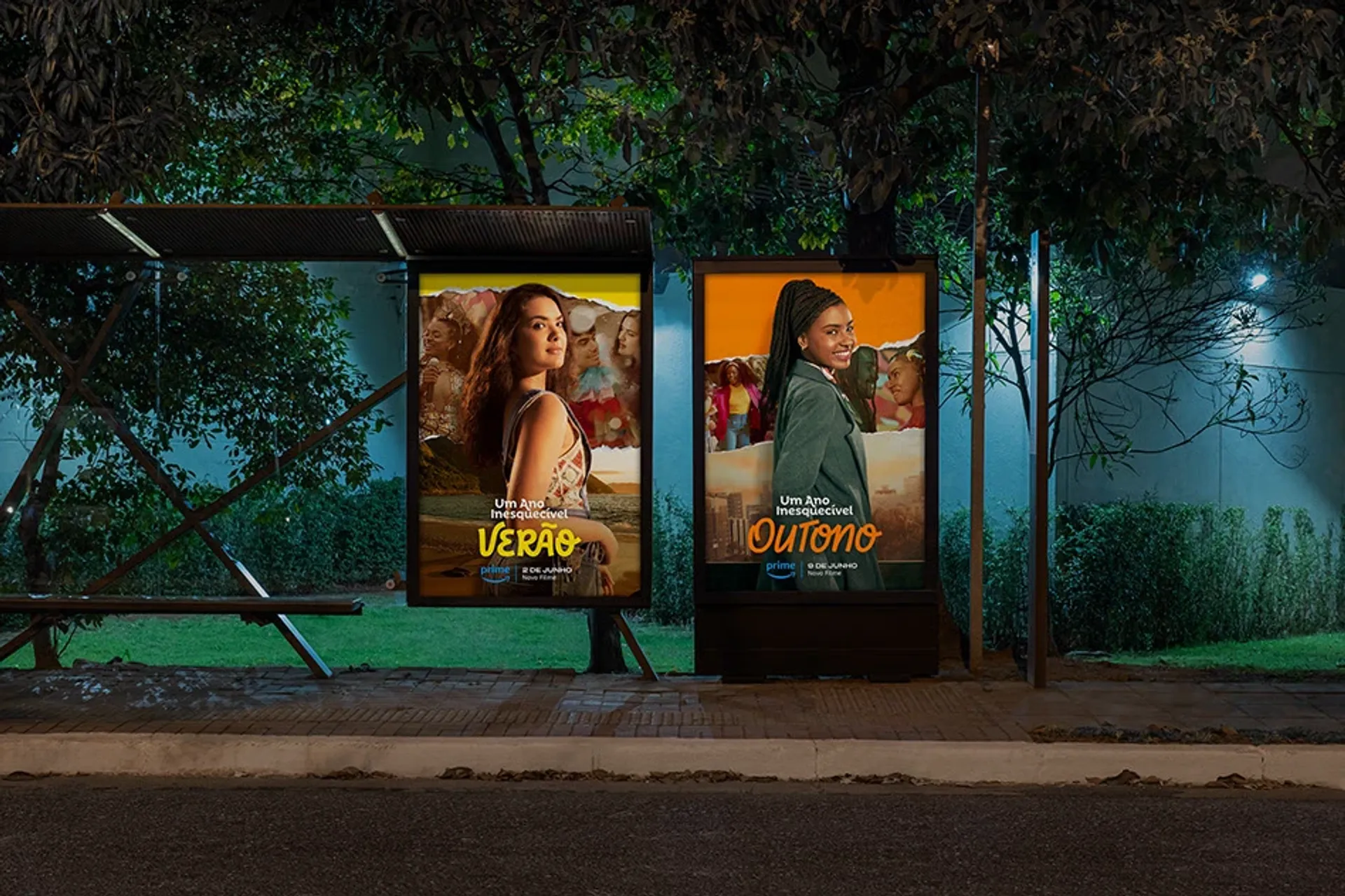
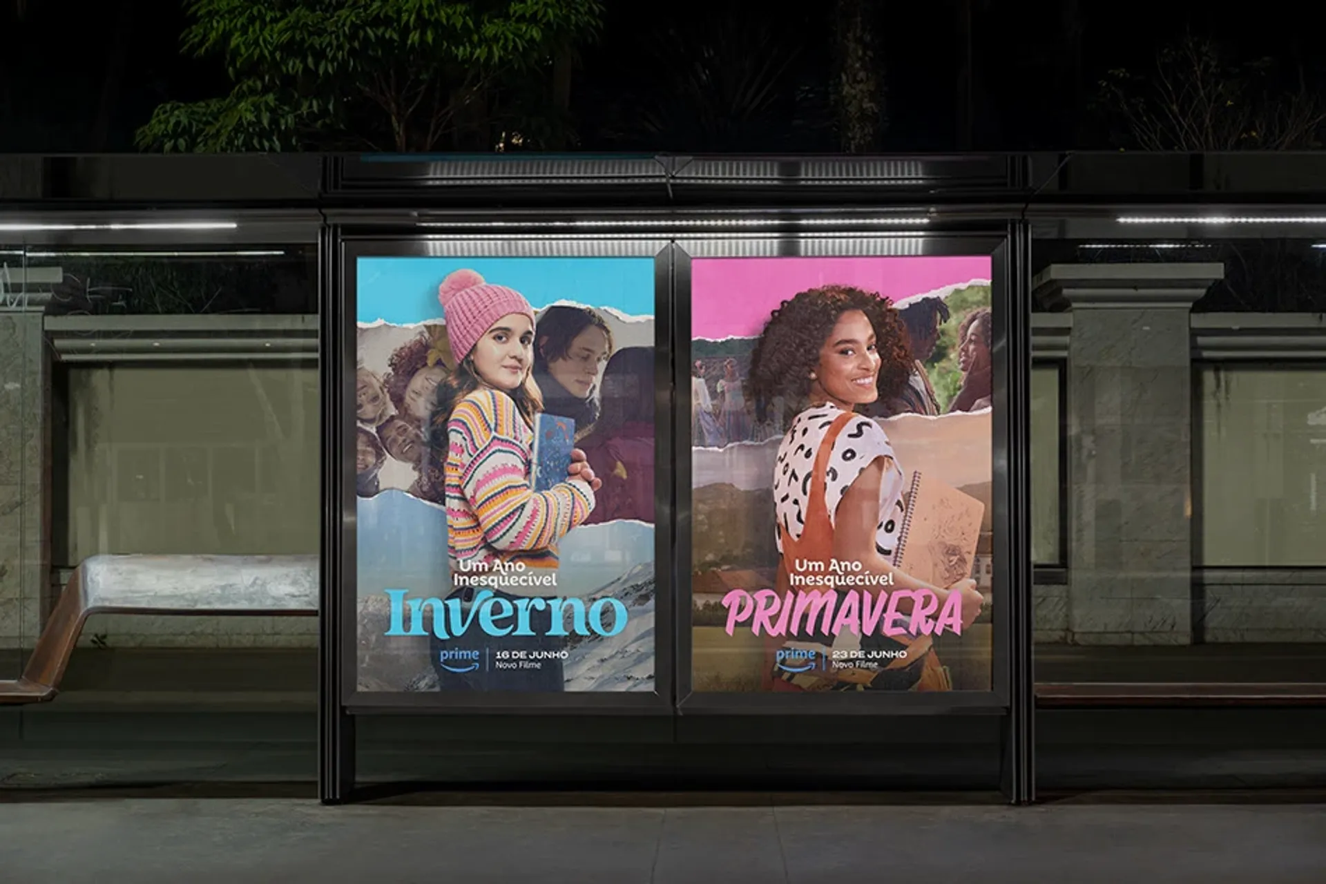
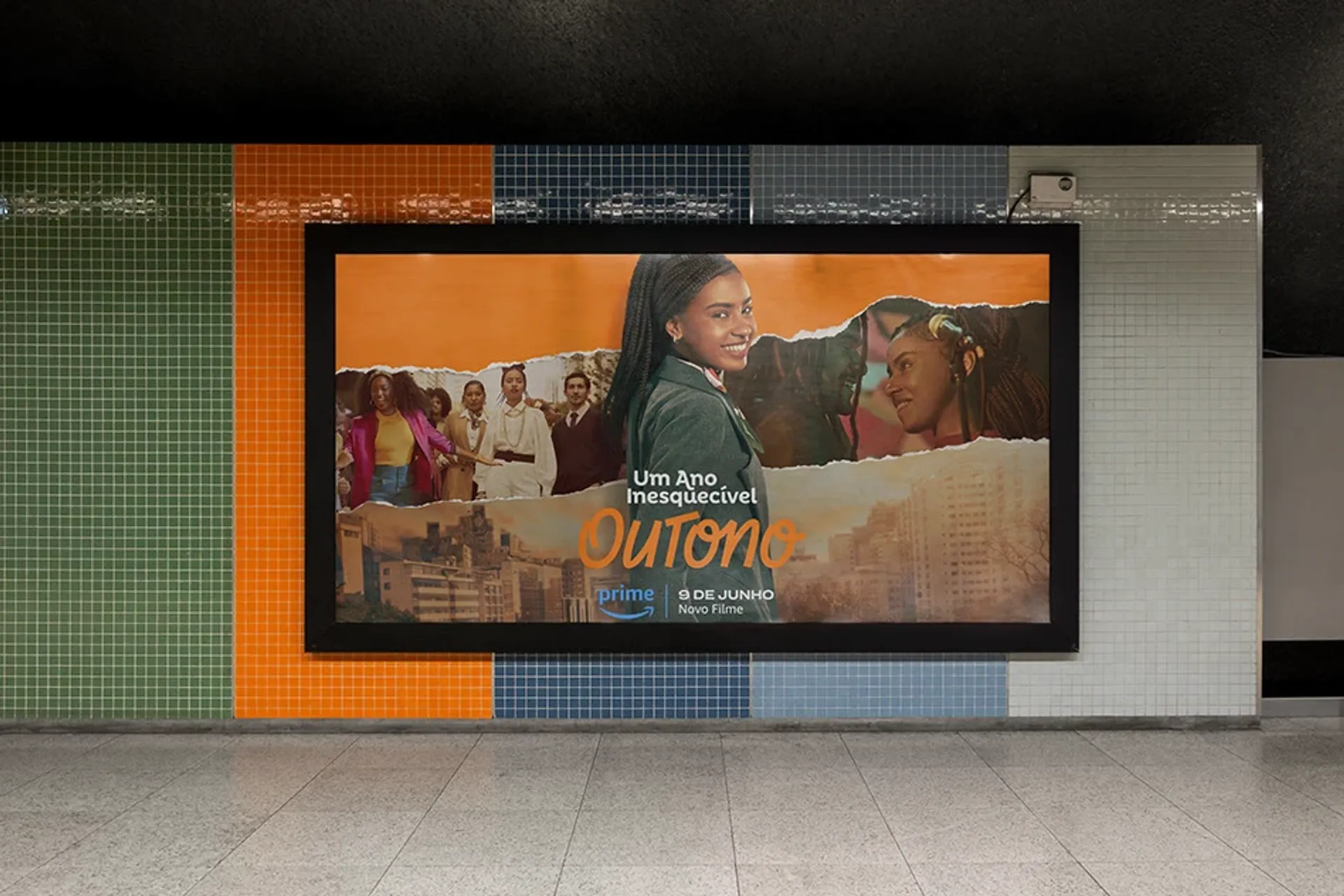
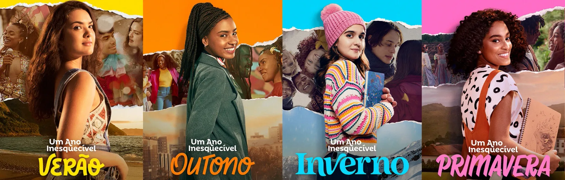
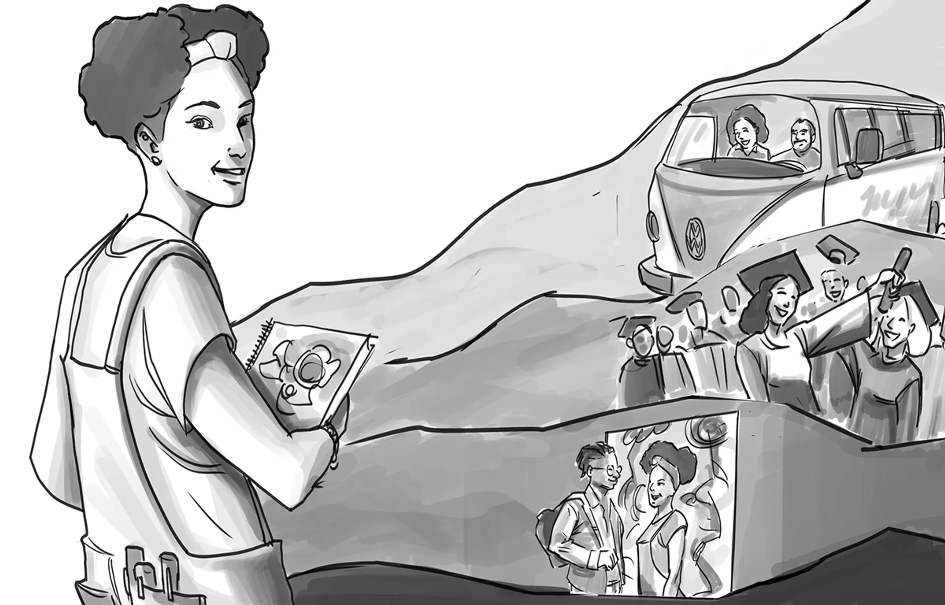
From the first contact with the original scripts to the creative translation into images that turned into richly storied visuals, it was necessary to follow an organized process involving a great deal of teamwork, suppliers, and clients. Each Key Art was inspired by the personality and attitude of the protagonists in each film. The photo production took place in four different locations that conveyed the mood of each film. The lettering for each season was developed to connect the narrative across the stories, aiming to express the personality of the protagonists, who provided us with their own handwritten lettering, as well as the artistic direction of each season, incorporating distinctive and unique elements from each film. This resulted in a set of exclusive, youthful, contemporary, and cohesive lettering designs.
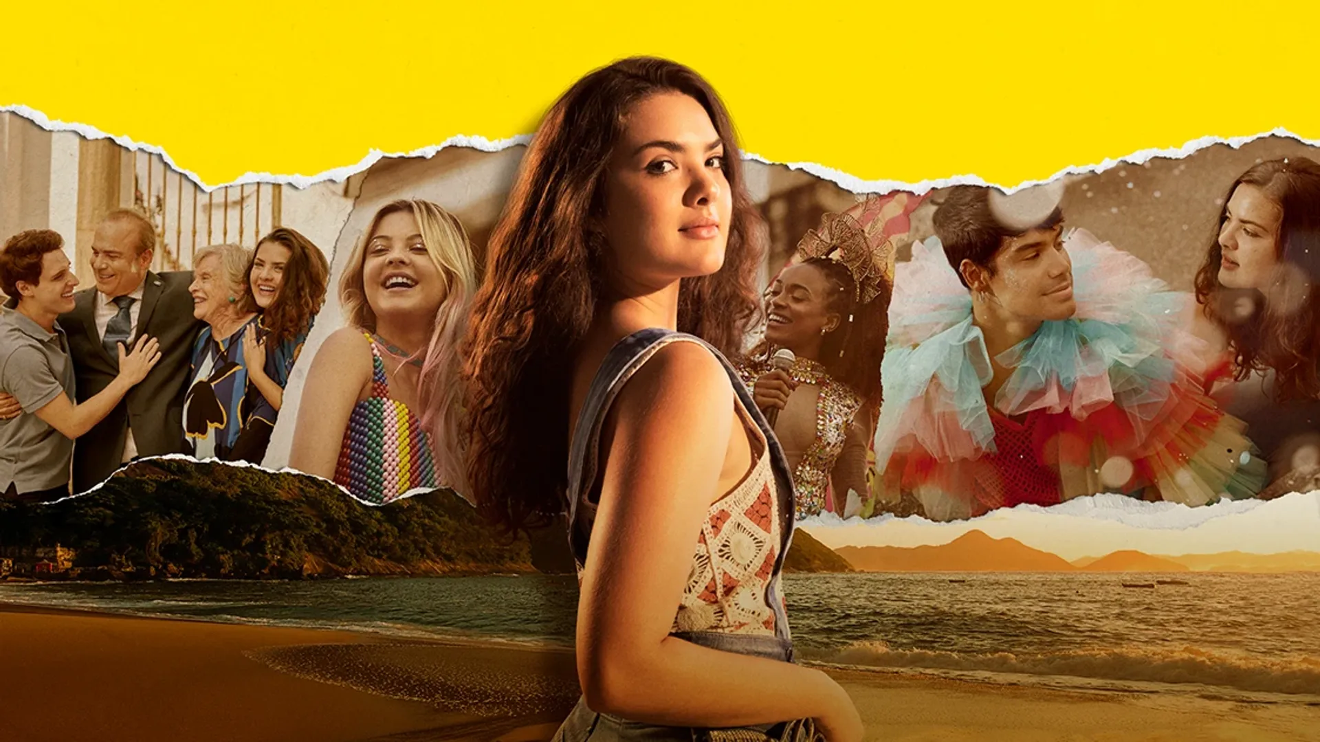
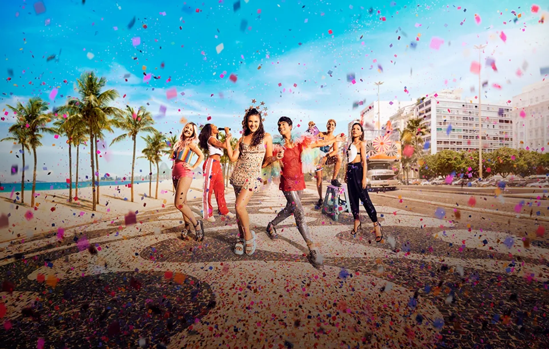
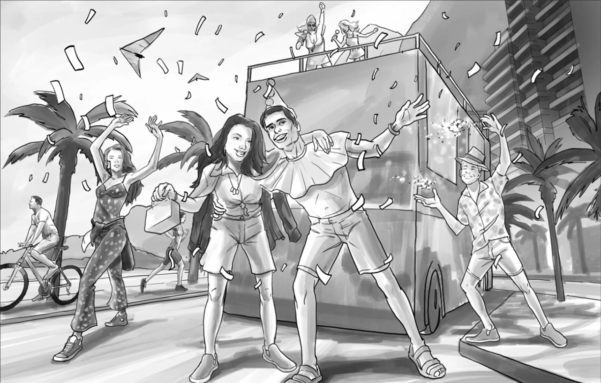
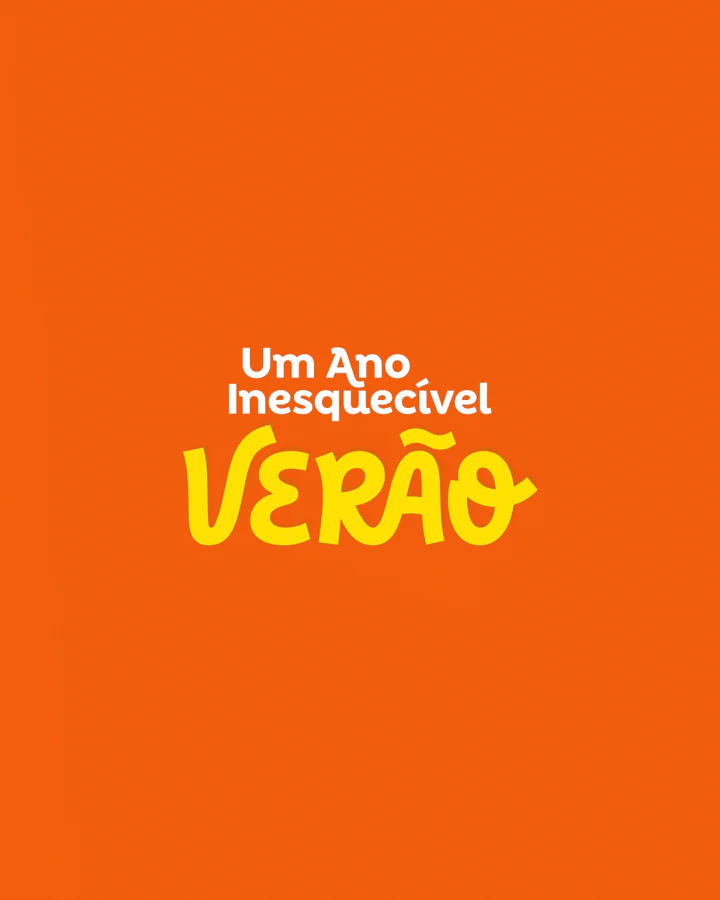
Summer — A colorful and joyful film set in Rio de Janeiro during carnival season, with a strong emphasis on the fashion world through the protagonist. Based on these central elements, the typography was created in a way that highlighted the curves of the city of Rio de Janeiro, represented by the Corcovado mountain and ocean waves, along with a ligature that symbolized the fashion element through sewing.
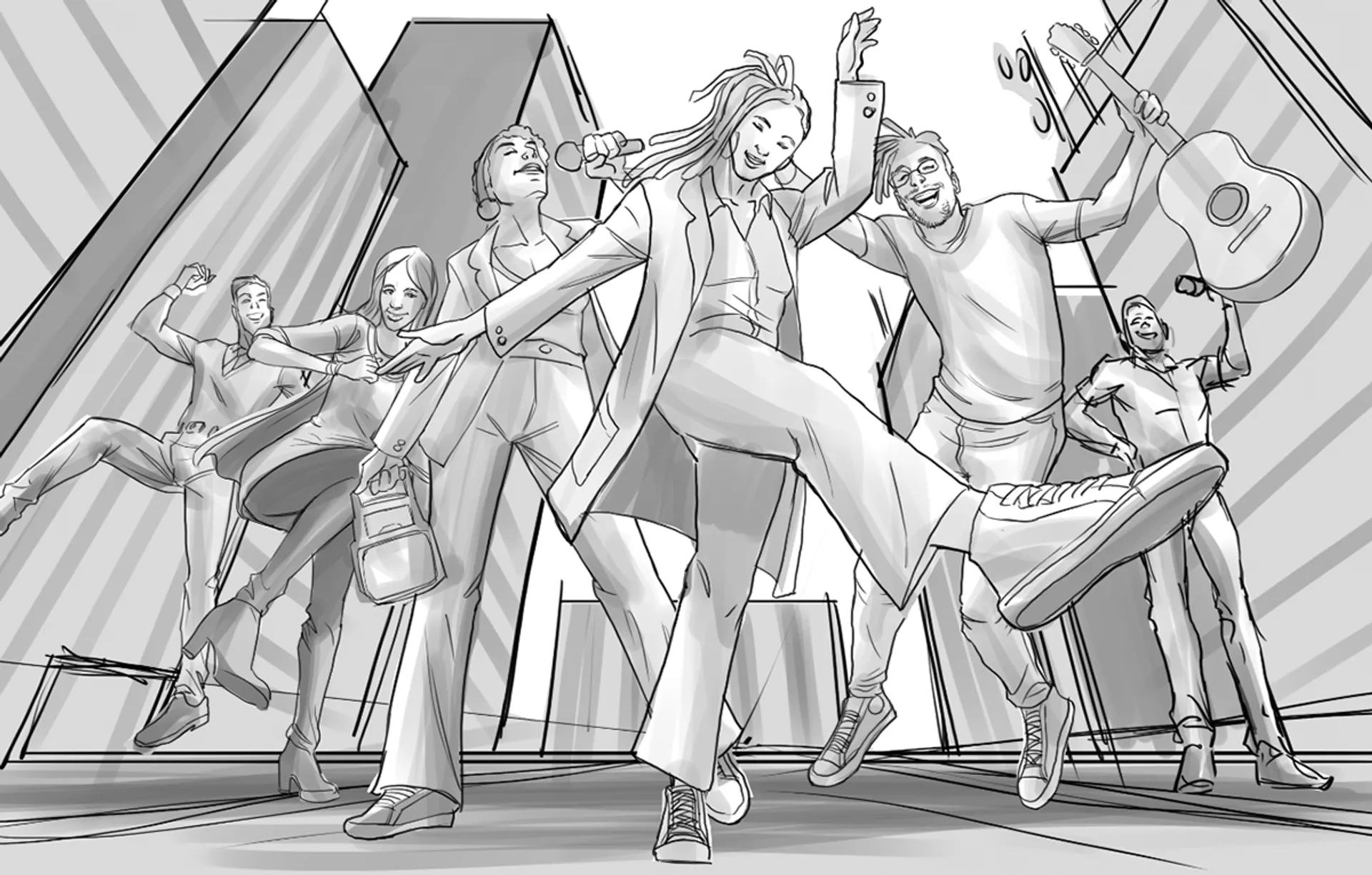
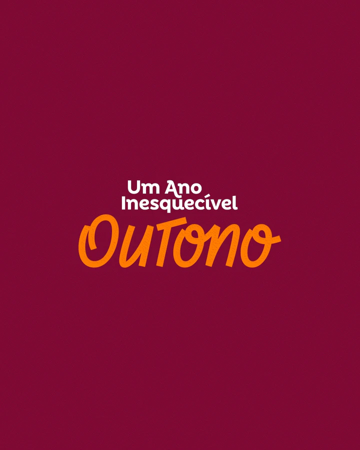
Autumn — Set in São Paulo, where the protagonists' story is intertwined with music and the hustle and bustle of a big city. Inspired by this, we developed a typography heavily influenced by urban tags and graffiti, with straight endings and a design for each letter that emphasized the movement of musical notes.
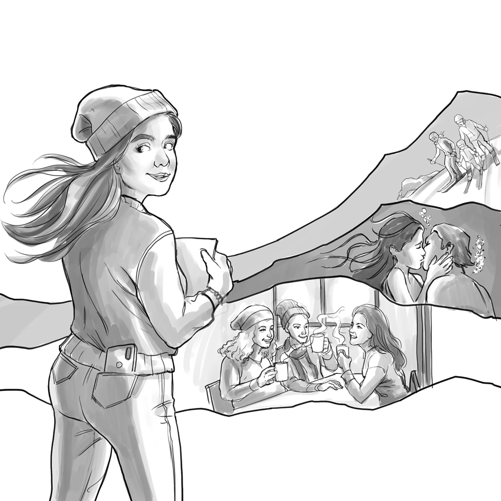
Winter — Taking place in the snowy mountains of Chile, the film's core revolves around a passion for literature and writing in general. The typography for winter was built around this theme, emphasizing serifs and ligatures reminiscent of typewriter writing, but with curves that add movement, giving the lettering a youthful and contemporary feel.
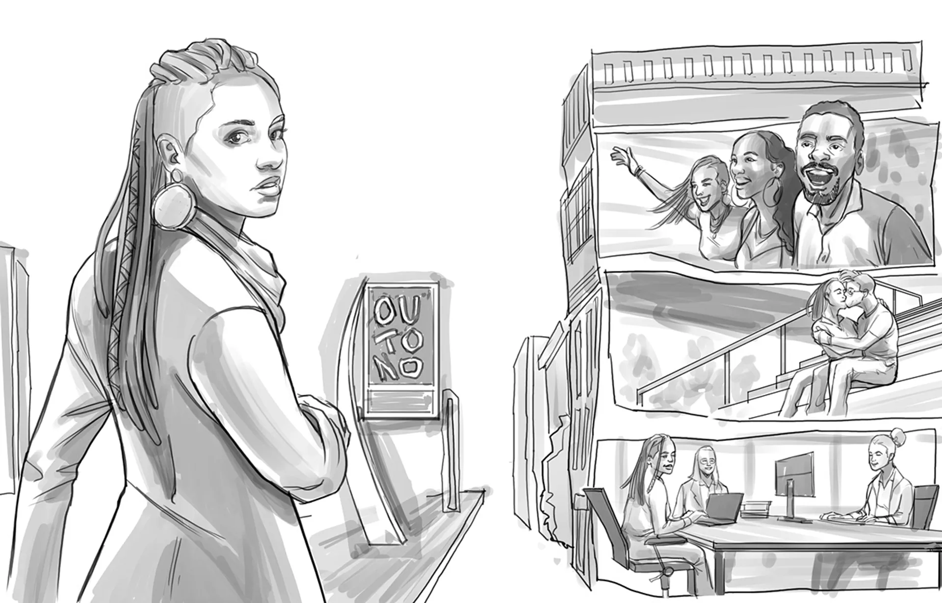
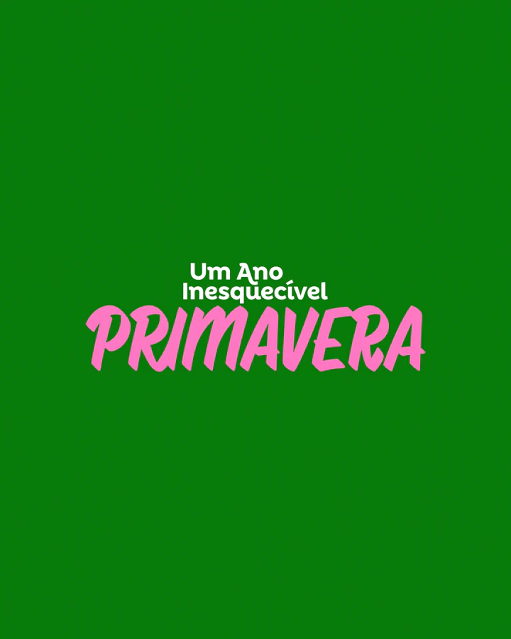
Spring — Set against the backdrop of Ouro Preto, Minas Gerais, the film has an artistic and dreamlike appeal through its protagonist. The typography was created based on these elements, where the strokes resemble brushstrokes, with their characteristic contrast.
An Unforgettable Year — Designed to have a less prominent role, with a clean design and a bold ending in the letter "A," serving as a surprise element that highlights the youthful and contemporary appeal of the films, without overshadowing the names of each film, which are translated and interpreted in three different languages.
Creative Process
From the first contact with the original scripts to the creative translation into images that turned into richly storied visuals, it was necessary to follow an organized process involving a great deal of teamwork, suppliers, and clients. Each Key Art was inspired by the personality and attitude of the protagonists in each film. The photo production took place in four different locations that conveyed the mood of each film. The lettering for each season was developed to connect the narrative across the stories, aiming to express the personality of the protagonists, who provided us with their own handwritten lettering, as well as the artistic direction of each season, incorporating distinctive and unique elements from each film. This resulted in a set of exclusive, youthful, contemporary, and cohesive lettering designs.
Summer — A colorful and joyful film set in Rio de Janeiro during carnival season, with a strong emphasis on the fashion world through the protagonist. Based on these central elements, the typography was created in a way that highlighted the curves of the city of Rio de Janeiro, represented by the Corcovado mountain and ocean waves, along with a ligature that symbolized the fashion element through sewing.
Autumn — Set in São Paulo, where the protagonists' story is intertwined with music and the hustle and bustle of a big city. Inspired by this, we developed a typography heavily influenced by urban tags and graffiti, with straight endings and a design for each letter that emphasized the movement of musical notes.
Winter — Taking place in the snowy mountains of Chile, the film's core revolves around a passion for literature and writing in general. The typography for winter was built around this theme, emphasizing serifs and ligatures reminiscent of typewriter writing, but with curves that add movement, giving the lettering a youthful and contemporary feel.
Spring — Set against the backdrop of Ouro Preto, Minas Gerais, the film has an artistic and dreamlike appeal through its protagonist. The typography was created based on these elements, where the strokes resemble brushstrokes, with their characteristic contrast.
An Unforgettable Year — Designed to have a less prominent role, with a clean design and a bold ending in the letter "A," serving as a surprise element that highlights the youthful and contemporary appeal of the films, without overshadowing the names of each film, which are translated and interpreted in three different languages.