

SOLUTION
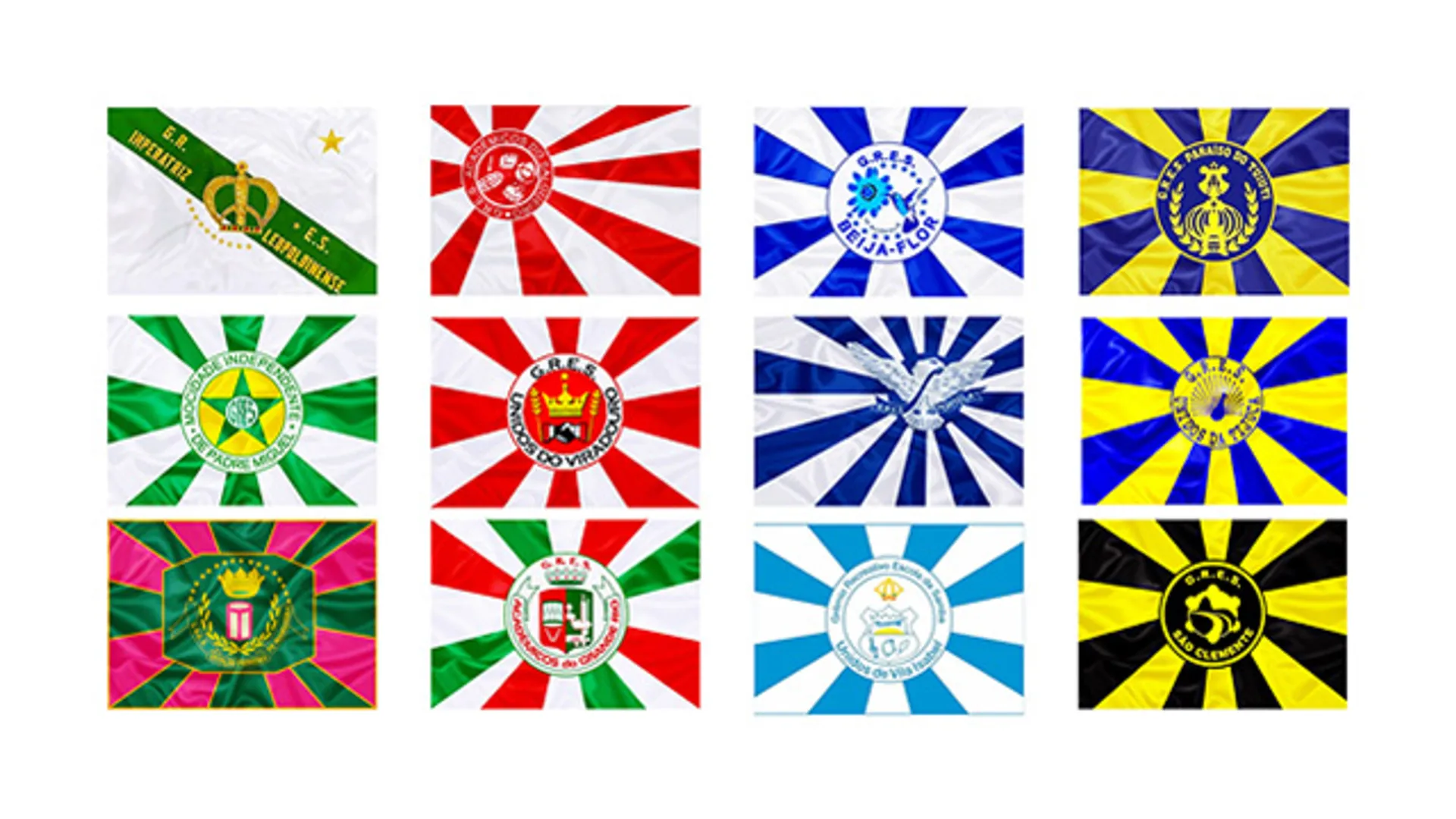
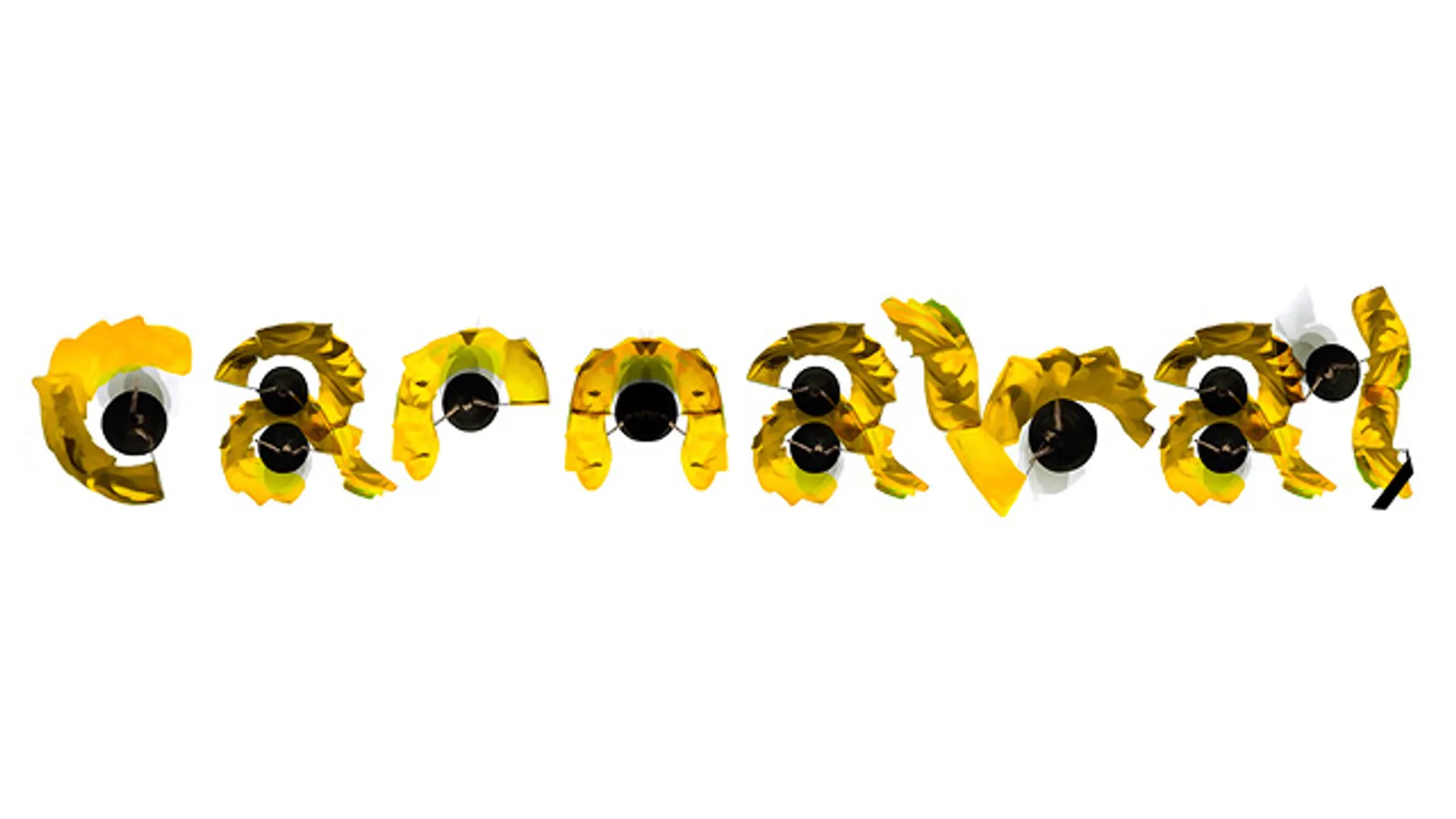
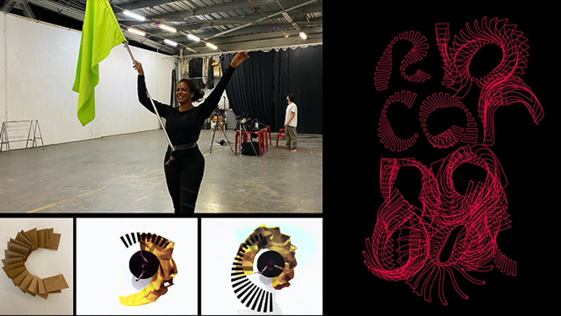
The Rio Carnaval brand was designed as a living identity, mirroring the energy and movement of the greatest show on Earth. Inspired by the fluid and rhythmic gestures of the flag bearer, the visual system transforms the parade’s essence into a dynamic language. More than just a logo, it is a shape that dances—its motion reflecting the collective power of samba. The typography, born from the circular movement of the flag, embraces organic and progressive forms, expanding the expressive potential of the brand. A design that vibrates with the people, the music, and the celebration itself.