
The strategic turning point was to recognize that Vanto Group occupies a symbolic territory of its own, not a middle ground between ready-made categories. Another central reading was that of the method's discretion, which does not show all its cards before the experience itself. That reserve, previously read internally as a communication challenge, was treated as a strength that needed sharper contour. The image that organized the visual construction came from strategy itself: Vanto Group triggers seismic movements through enduring insights, deeply realigning the system of every organization it works with.
The strategic turning point was to recognize that Vanto Group occupies a symbolic territory of its own, not a middle ground between ready-made categories. Another central reading was that of the method's discretion, which does not show all its cards before the experience itself. That reserve, previously read internally as a communication challenge, was treated as a strength that needed sharper contour. The image that organized the visual construction came from strategy itself: Vanto Group triggers seismic movements through enduring insights, deeply realigning the system of every organization it works with.
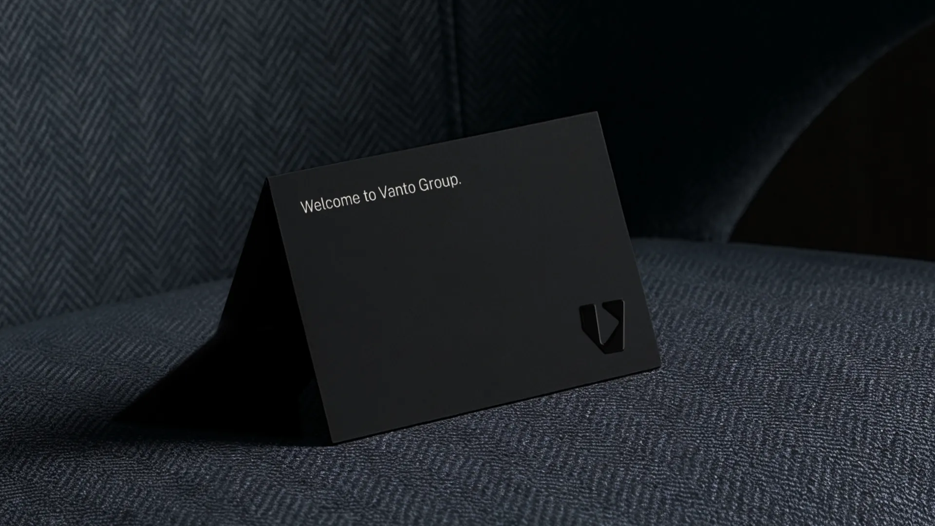
This principle was translated into creative coding system based on a modular circular grid. On this platform, shapes emerge from the spaces between the circles, generating customizable compositions that serve as a visual analogy: the brands flexibility to adapt to challenges of any scale. The new symbol is a V with an inner arrow pointing forward, embodying the "Forward from the Future" that sits at the heart of the method. Photography turns discretion into a visual principle, with images that are never fully delivered, and information is organized through editorial logic, in a contained elegance.
This principle was translated into creative coding system based on a modular circular grid. On this platform, shapes emerge from the spaces between the circles, generating customizable compositions that serve as a visual analogy: the brands flexibility to adapt to challenges of any scale. The new symbol is a V with an inner arrow pointing forward, embodying the "Forward from the Future" that sits at the heart of the method. Photography turns discretion into a visual principle, with images that are never fully delivered, and information is organized through editorial logic, in a contained elegance.