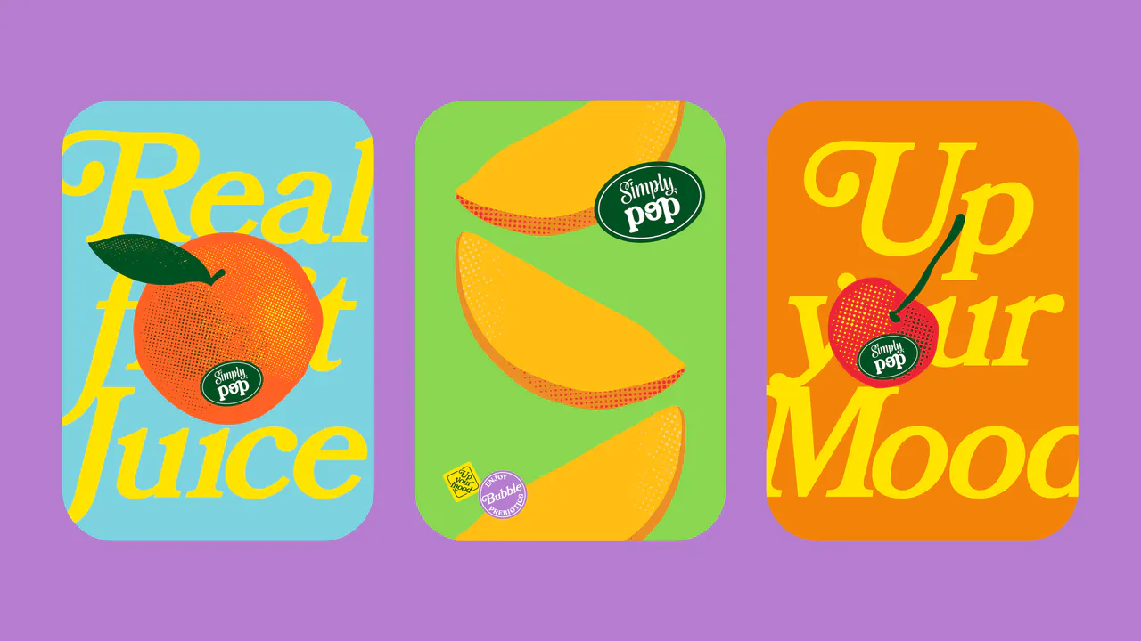
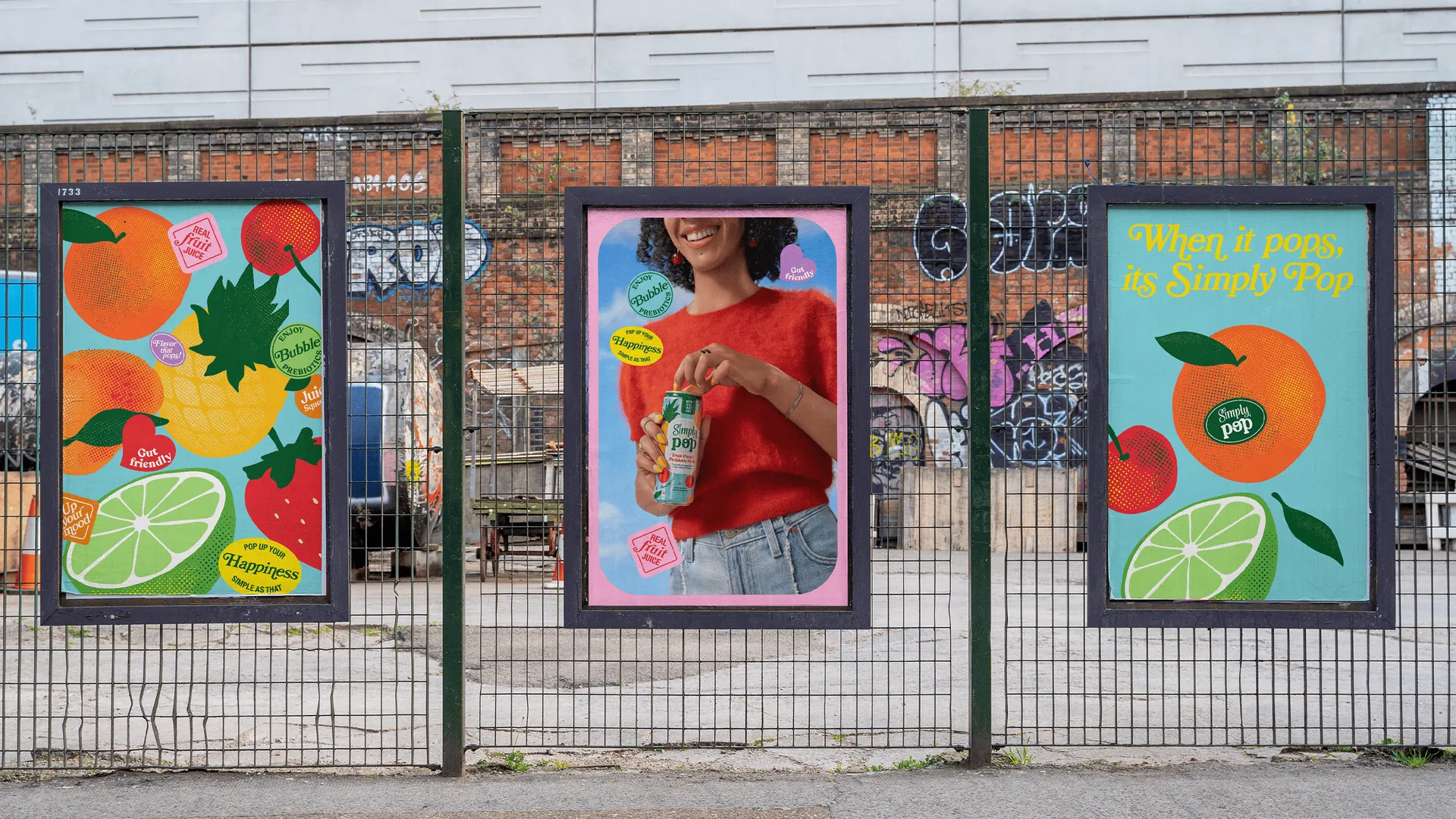
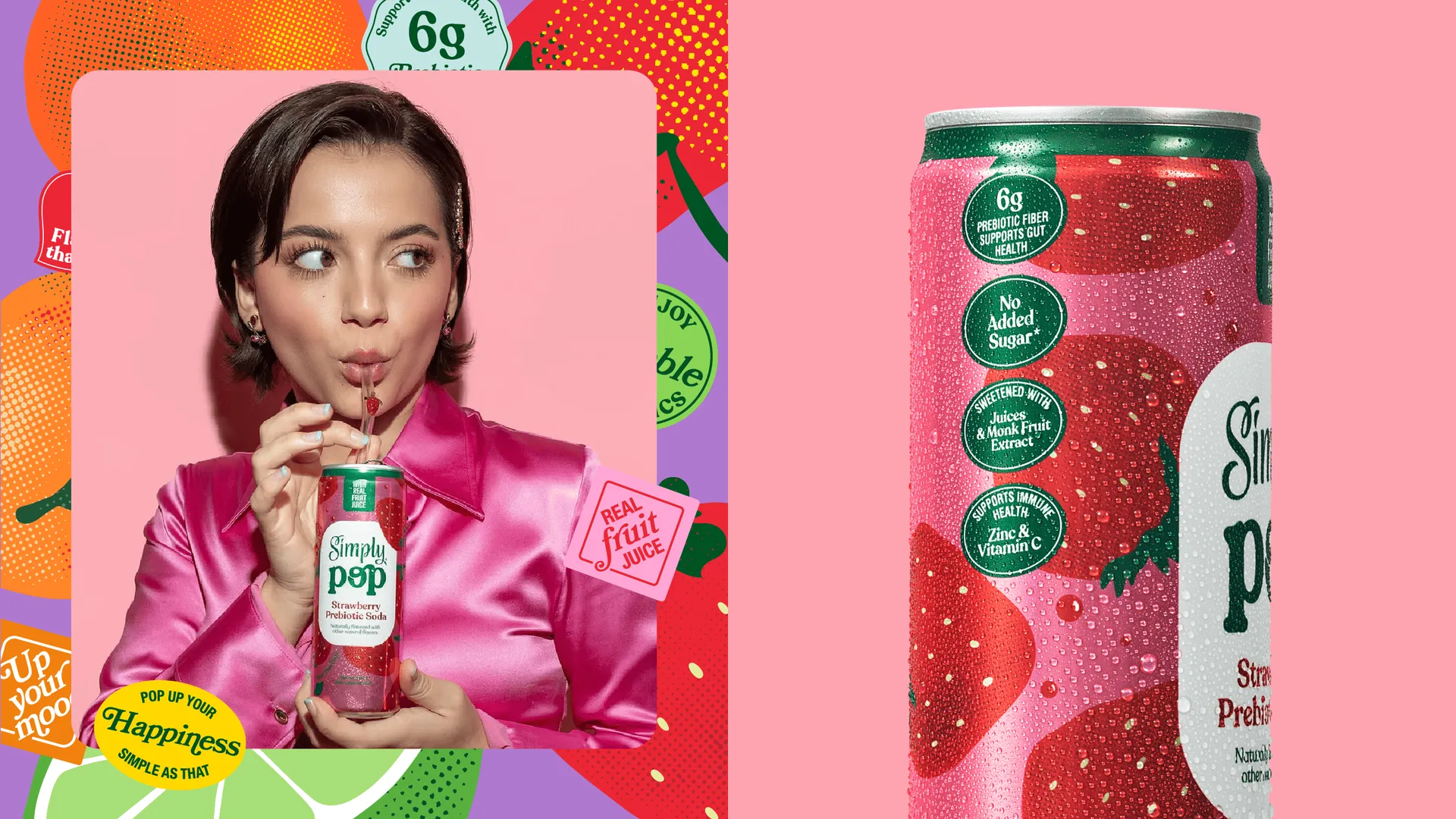
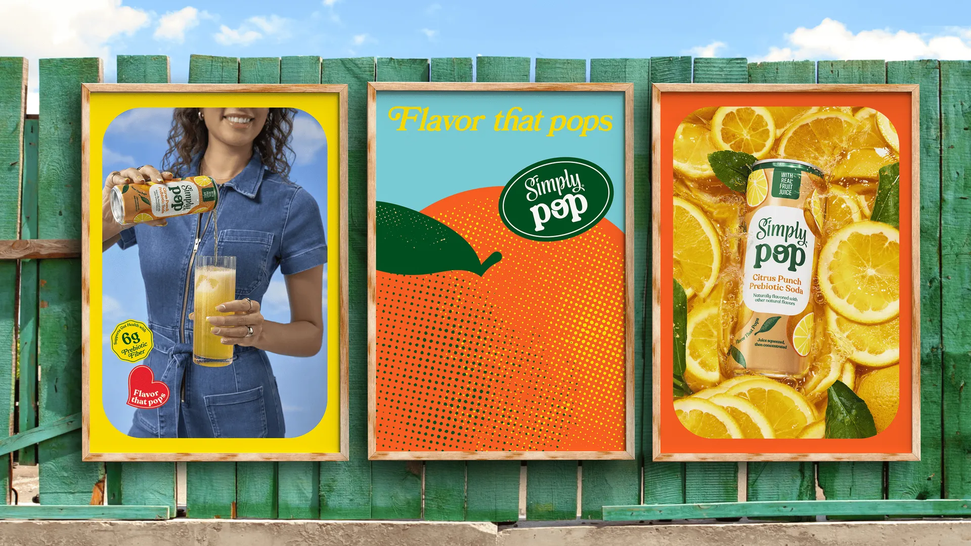
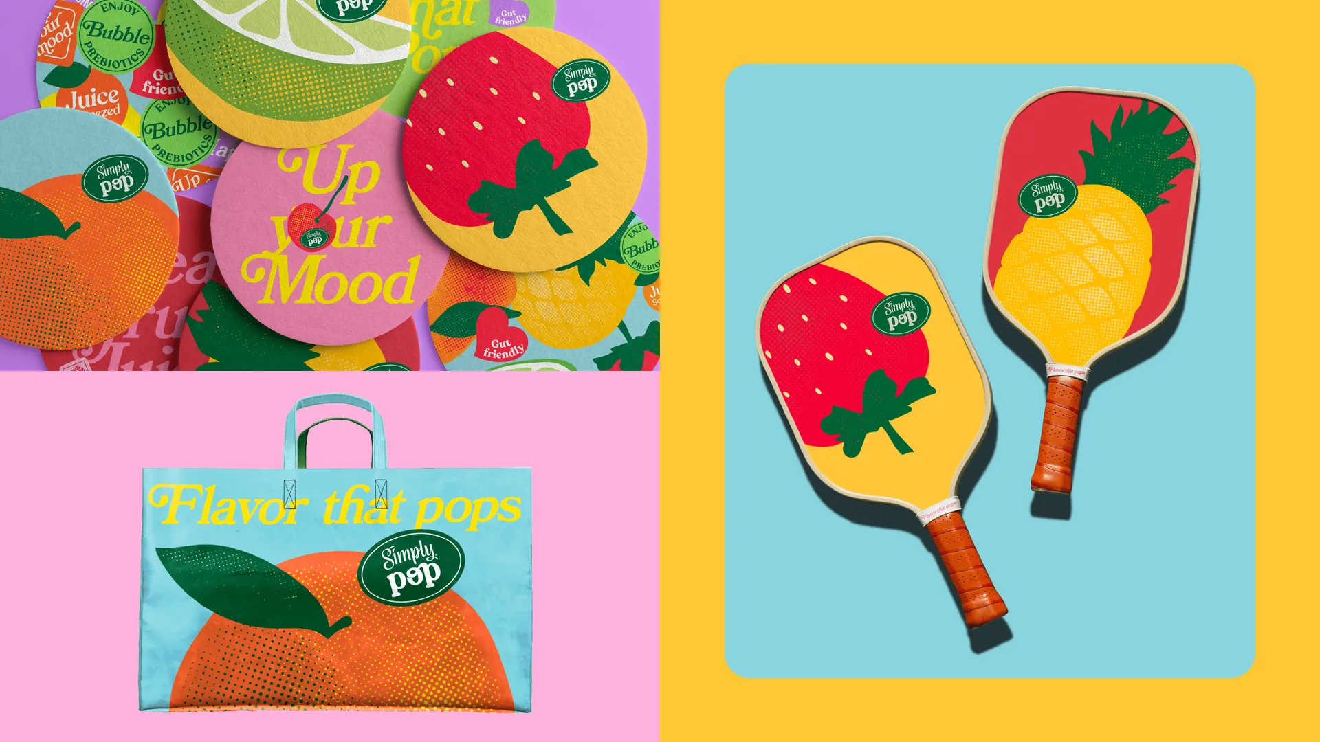
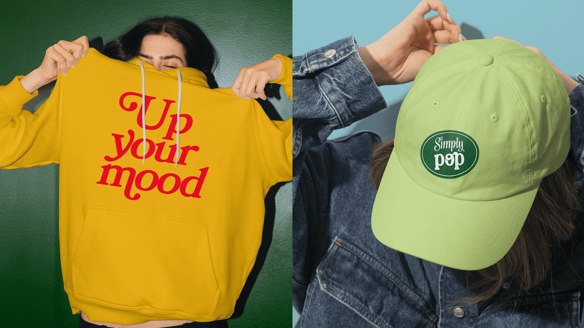
Solution
To translate the lightness and energy of Simply Pop, we created a visual language that starts from fruit — but breaks away from conventional naturalness. The system embraces vibrant colors, unexpected graphic compositions, and a sensorial, youthful aesthetic — closer to pop culture than to the typical wellness universe.

Inspired by Pop Art, the illustration style helped us reinterpret the fruit stickers — transforming them from generic labels into carriers of product personality, impact, and originality.
The language combines the simplicity of fruit with expressive, eye-catching and contemporary visual elements. The result is a brand that stands out on the shelf, connects with evolving consumption habits, and expands Simply’s reach into new experiences and territories.