Context & Challenges
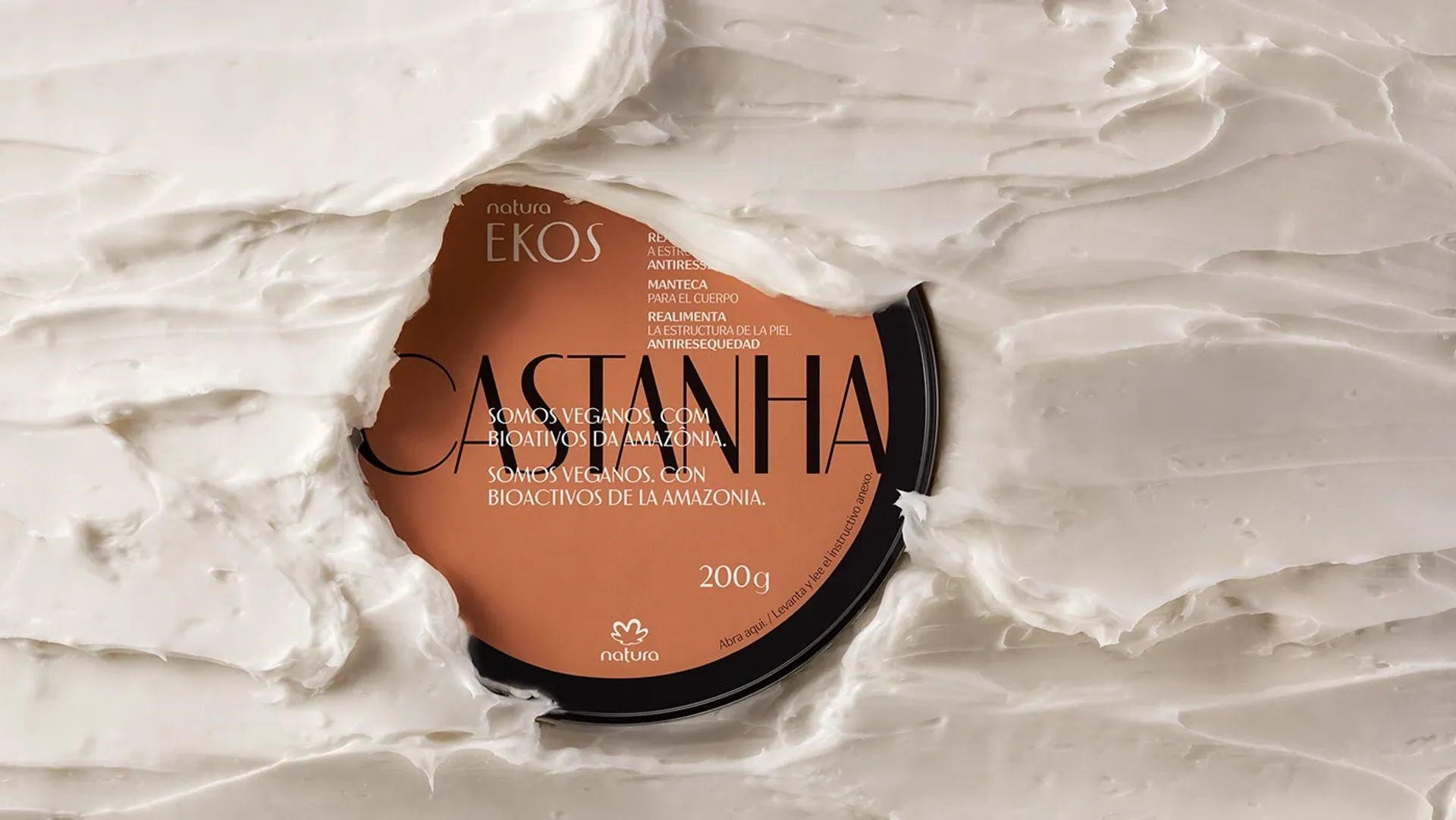
To evolve the new packaging, we set out to reclaim the core strengths of Natura Ekos. In this essential brand touchpoint, we brought forward origin, strength, the Amazon, sensation and meaning. Bioactives were given the prominence they deserve. With transparency and simplicity, the powerful sensorial qualities of each product were highlighted. A clear hierarchy was established to emphasize what matters most, using the bioactive name as a graphic element and transparency to showcase the product itself. A manifesto packaging system that carries the positioning and values of Natura Ekos, taking the brand to its highest level of expression. The system also includes adaptations for giftable versions, where illustrations reinforce the presence of each bioactive across seasonal brand moments.
The new Natura Ekos packaging successfully elevated the brand to its place of maximum potency, clearly communicating its positioning and manifesto to consumers. In addition to strong consumer research results, the project exceeded expectations by delivering a bold, distinctive packaging line with clear protagonism.