Context & Challenges
Our challenge
To evolve Tim Hortons’ QSR language into the Coffee Shop model.
Our strategic approach
One of the largest QSR (Quick Service Restaurant) chains is expanding its operation to new continents with the intention of sharing the best of Canada with the world in a different way. We have created a fresh language for Tim Hortons’ Coffee Shop, with graphic elements, packaging, photography that approach, welcome and explore the senses. An inviting, human and real language that respects the main assets of a brand with more than 50 years of history and places Tim’s as a cozy place to eat, taste, be.
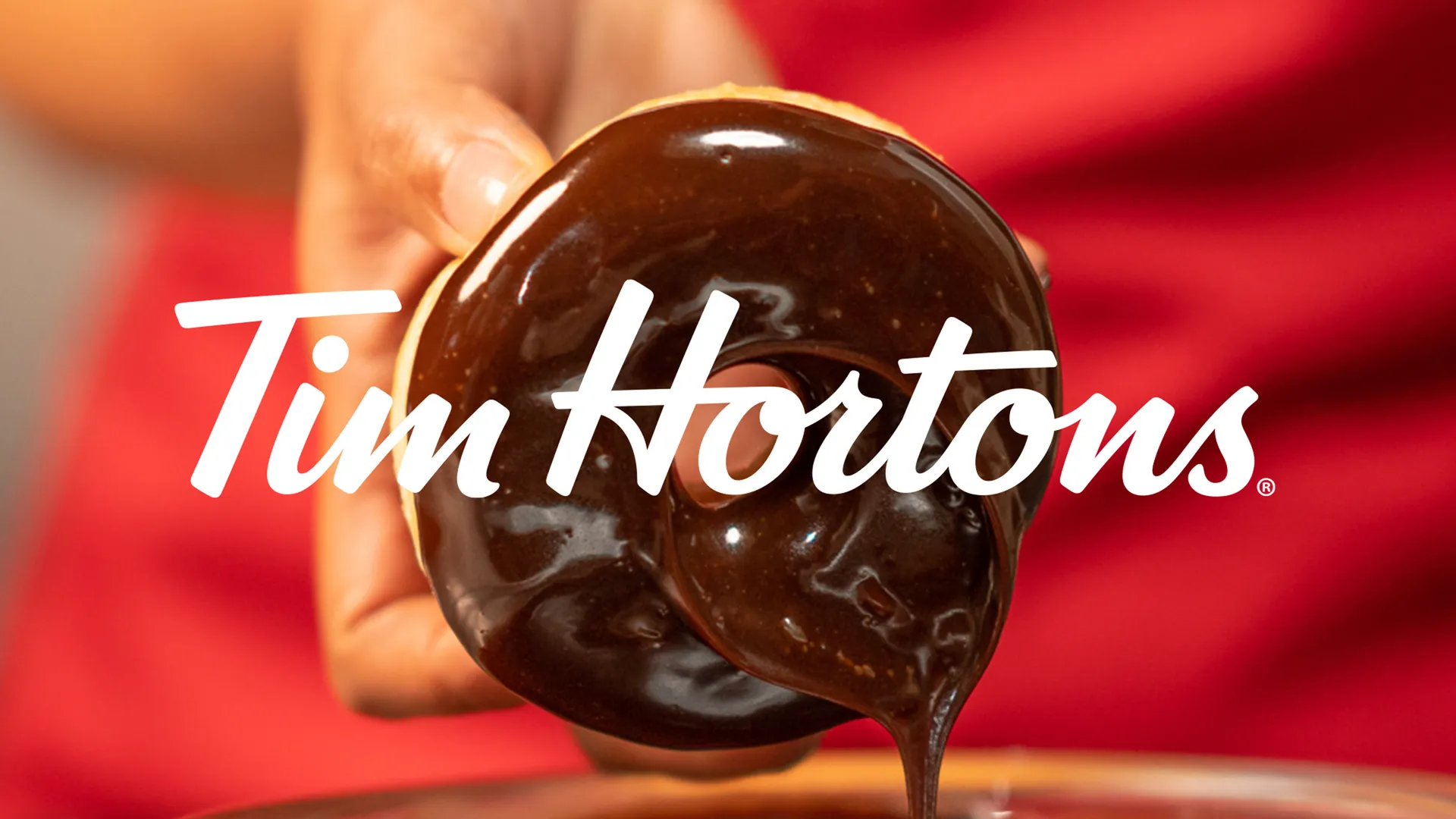
The glazed packaging system
In packaging, we explored the brand’s way in order to create a fresh system that was both sensorial and highly replicable. We took inspiration from TimHortons classic glazed donuts and printed these packages in kraft paper, with a technical drawing demanding less glue and helped assemblage by their own collaborators.