Context & Challenges
We used design to bring new sensations and emotions to thousands of Netflix fans. A concept grounded in user experience and aligned with brand principles, where fun is intrinsic to every project. Users can explore, be delighted, get lost, feel free — a democratic space that welcomes different people and ways of being.
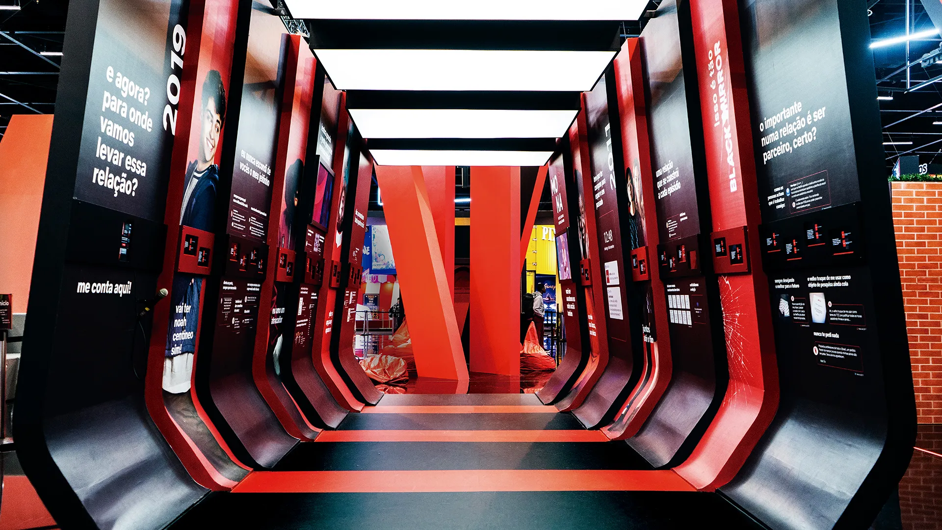
The red ribbon that originated the brand’s logo is used as the main guide for the entire spatial language, serving as the initial inspiration for all projects within the spaces. It brings dynamism to the environment, creating forms, dividing planes, and interconnecting everything that happens around it. It is the focal point of the entire structure, from which the attractions unfold and, later, the audience interactions.
An open layout allows people to enter from any direction, with no right or wrong path. The audience has the chance to discover and define their own journey. The spaces themselves become an experience.
To accommodate areas of varying sizes, fixed elements were created — present in any project — along with flexible elements that can vary depending on the occasion, and a free element. Together, they form a modular design system that can be adapted according to each need.